Zivver website redesign
Making complex email security easier to understand
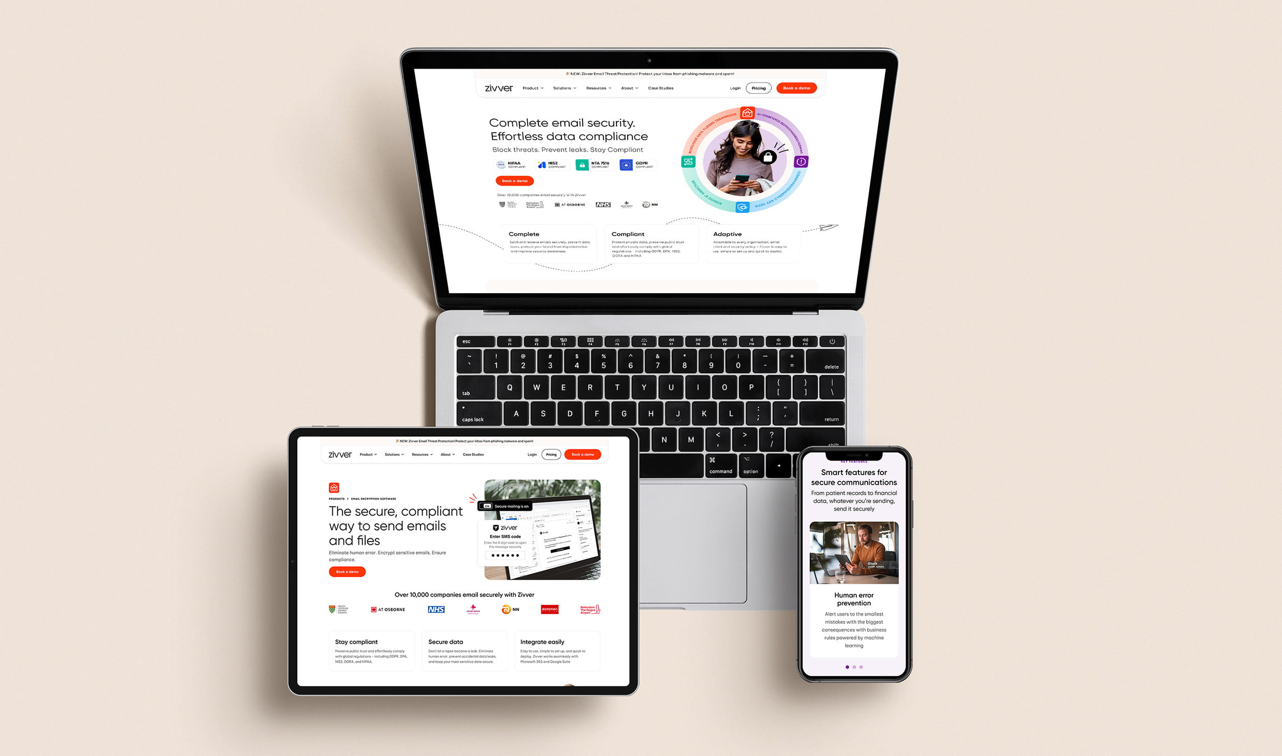
A complete redesign of Zivver’s website, restructuring the experience around its core products and creating a new visual language that made complex email security features clearer, more human and easier to understand.
Website strategy · UX/UI · Visual direction · Responsive design · Custom graphics
The challenge
Zivver offers a broad suite of email security and compliance products, which meant the website needed to communicate a lot of technical information without overwhelming users.
Working closely with the content and product teams, I developed a deeper understanding of the platform and its different audiences. We then restructured the site to create clearer journeys and give greater prominence to Zivver’s hero products.
Restructuring the experience
A significant part of the project involved reconsidering the website architecture and the routes users took through the site.
The redesigned experience introduced clearer pathways into Zivver’s key products and grouped related information more logically, helping users move from understanding a problem to discovering the most relevant solution.
Layouts were designed around clear content hierarchies and reusable sections, allowing detailed product information, compliance requirements, integrations, proof points and calls to action to coexist without pages feeling overly dense.
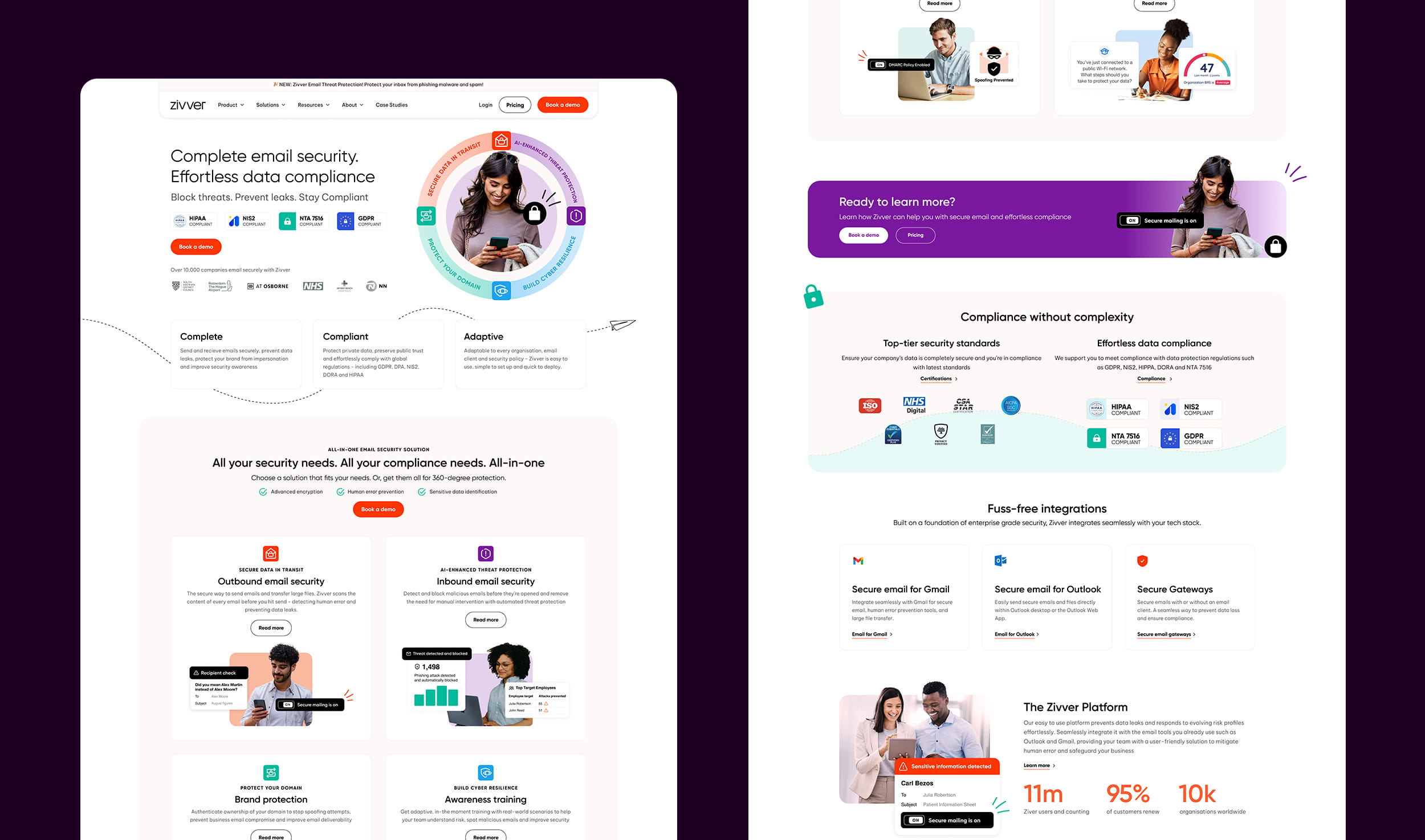
A more human visual language
The previous website relied heavily on illustration to communicate technical concepts. I evolved this approach by taking elements of that graphic language and combining them with cut-out photography, real-world scenarios and actual product UI.
Alerts, notifications and interface elements were layered around users to show the technology working in context making otherwise invisible processes easier to understand at a glance.
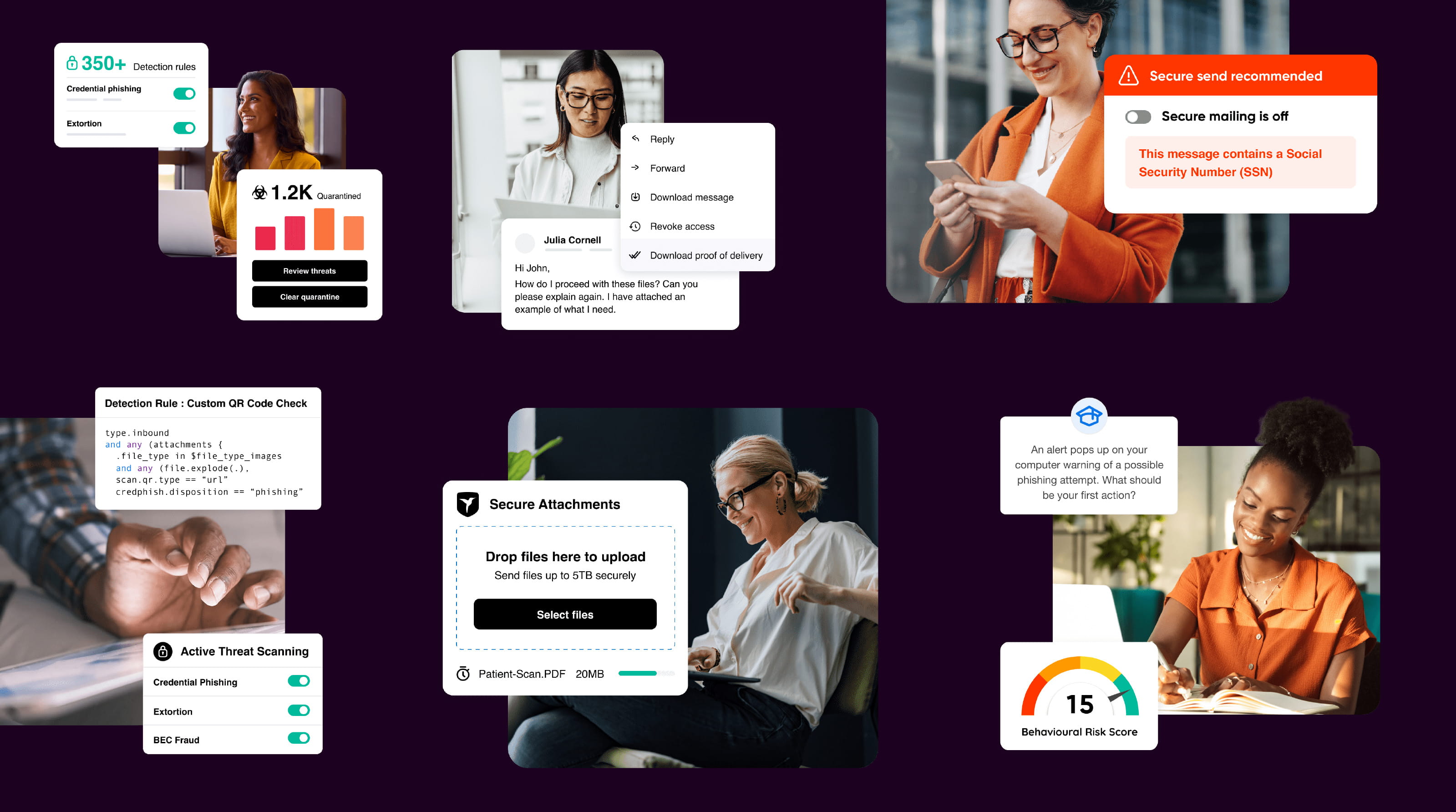
Bringing the product into the brand
Real product interfaces became an important part of the website’s visual identity rather than being confined to product screenshots.
This created a flexible system for communicating different features, situations and customer problems while giving the website a more distinctive and recognisable visual style.
Designing at scale
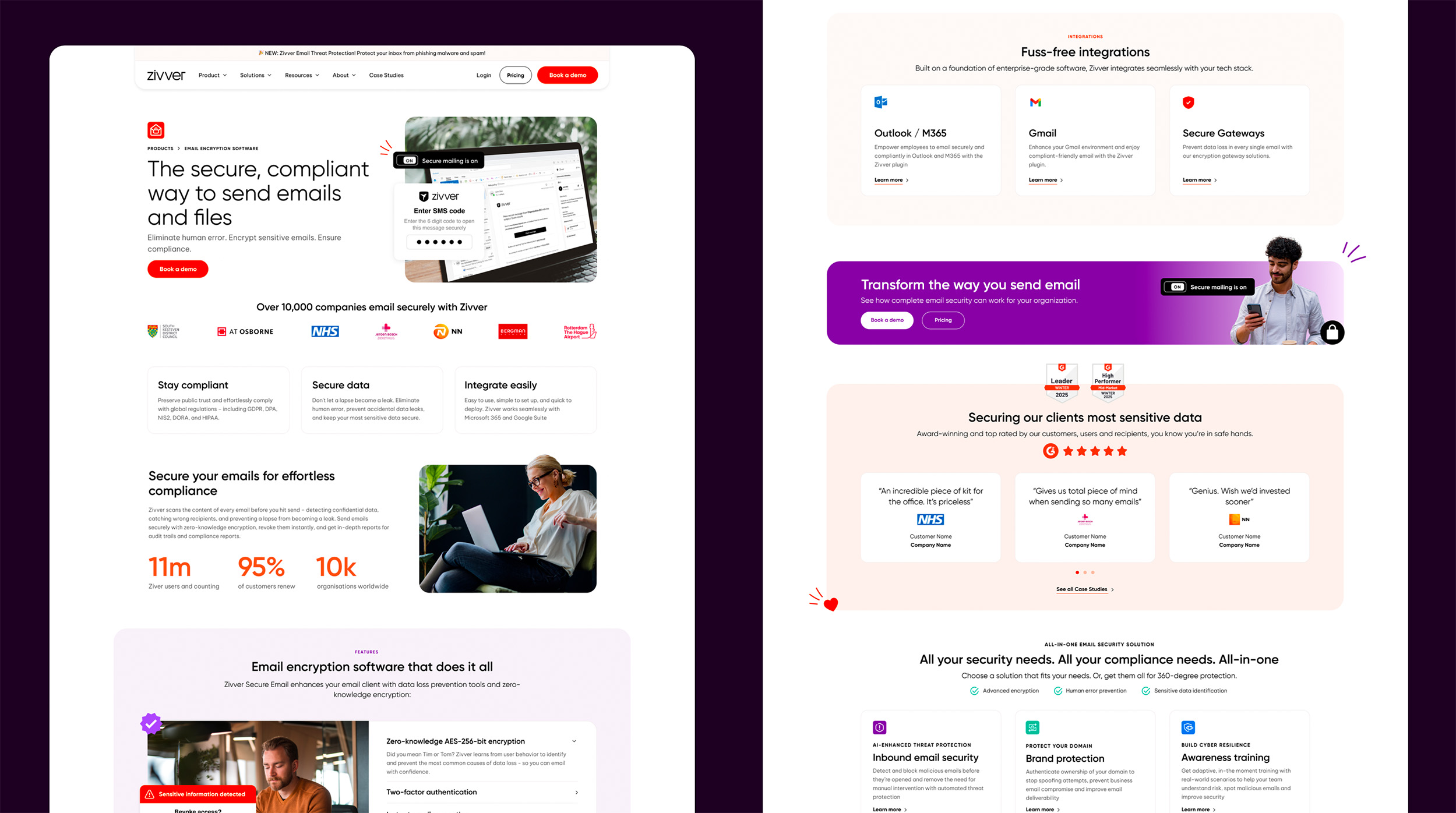
The project covered a large number of pages, so the design needed to work as a system rather than as a collection of individually art-directed layouts.
I developed reusable page structures and visual patterns that could accommodate product information, integrations, compliance content, customer proof points and campaign messaging while maintaining consistency across the site.
The system also needed to support both the English and Dutch websites, meaning layouts had to remain flexible enough to accommodate differences in language and content length.
Collaboration
The project was developed closely with Zivver’s internal content and product teams.
Product specialists helped me understand the functionality and technical differences between the various tools, while ongoing collaboration with the content team allowed the information architecture, messaging and design to evolve together.
That collaborative process was particularly important on a project where the design needed to simplify technically complex information without losing accuracy.
The result
The final design created a much clearer digital expression of Zivver’s offering, bringing its core products to the forefront and giving the company a more distinctive visual language online.
The combination of simplified journeys, reusable design patterns and product-led imagery helped turn a technically complex offering into an experience that was easier to navigate, understand and communicate.
I designed the complete experience across English and Dutch, including the page layouts and supporting graphic assets used throughout the site.