Opção
The project
Branding · Graphic Design · Art Direction · AI Image Generation · Shopify Web Design · Shopify Theme Customisation
Opção is a UK men’s intimate care brand creating natural products for issues that aren’t always easy to talk about.
I worked with the brand to refresh its visual identity and completely rethink how it presented itself online. The challenge was an unusual one: how do you market products designed to help with tight foreskin and intimate hygiene in a way that feels credible, masculine and reassuring — without becoming either overly clinical or unnecessarily explicit?
The result was a more confident and cohesive brand with two complementary sides: a premium, photography-led visual identity for the website and product experience, alongside a bolder, more playful approach to social content designed to get people talking.
The challenge
Opção already had an established product range and ecommerce presence, but the existing visual identity and website didn’t fully communicate the quality of the products or the confidence of the brand.
The subject matter created an additional design challenge.
The products solve a very specific intimate problem, so imagery needed to make the purpose of the brand understandable without relying on anything graphic, sexualised or uncomfortable. At the same time, being too vague or clinical risked making the brand feel medical and impersonal.
The visual direction therefore needed to find a careful balance between:
- masculine and approachable
- informative without becoming clinical
- premium without feeling inaccessible
- sensitive without avoiding the subject entirely
- playful enough to start conversations without making light of the problem
It also needed to work across very different environments, from a polished ecommerce website to attention-grabbing social media advertising.
Refreshing the brand
Rather than replacing the existing identity entirely, I developed a more complete visual system around the Opção brand.
The refresh introduced a refined natural colour palette built around slate grey, cream, earthy browns and greens, giving the products a warmer and more premium feel while reinforcing the natural ingredients behind them.
Typography was also reworked into two complementary systems.
For the website and core brand communications, I introduced a clean, understated typographic style designed to feel calm, accessible and trustworthy. For social media and advertising, this was paired with a much bolder typographic treatment that could communicate short, direct messages with considerably more impact.
This gave Opção flexibility without losing consistency: the brand can feel sophisticated and reassuring when somebody is researching a sensitive problem, but much more direct when it needs to grab their attention in the first place.
I brought these decisions together into a complete brand style guide covering colour, typography, logo use, photography, product imagery, iconography, website styling, social media and content themes.
Finding the right visual language
Photography became a central part of the refreshed identity.
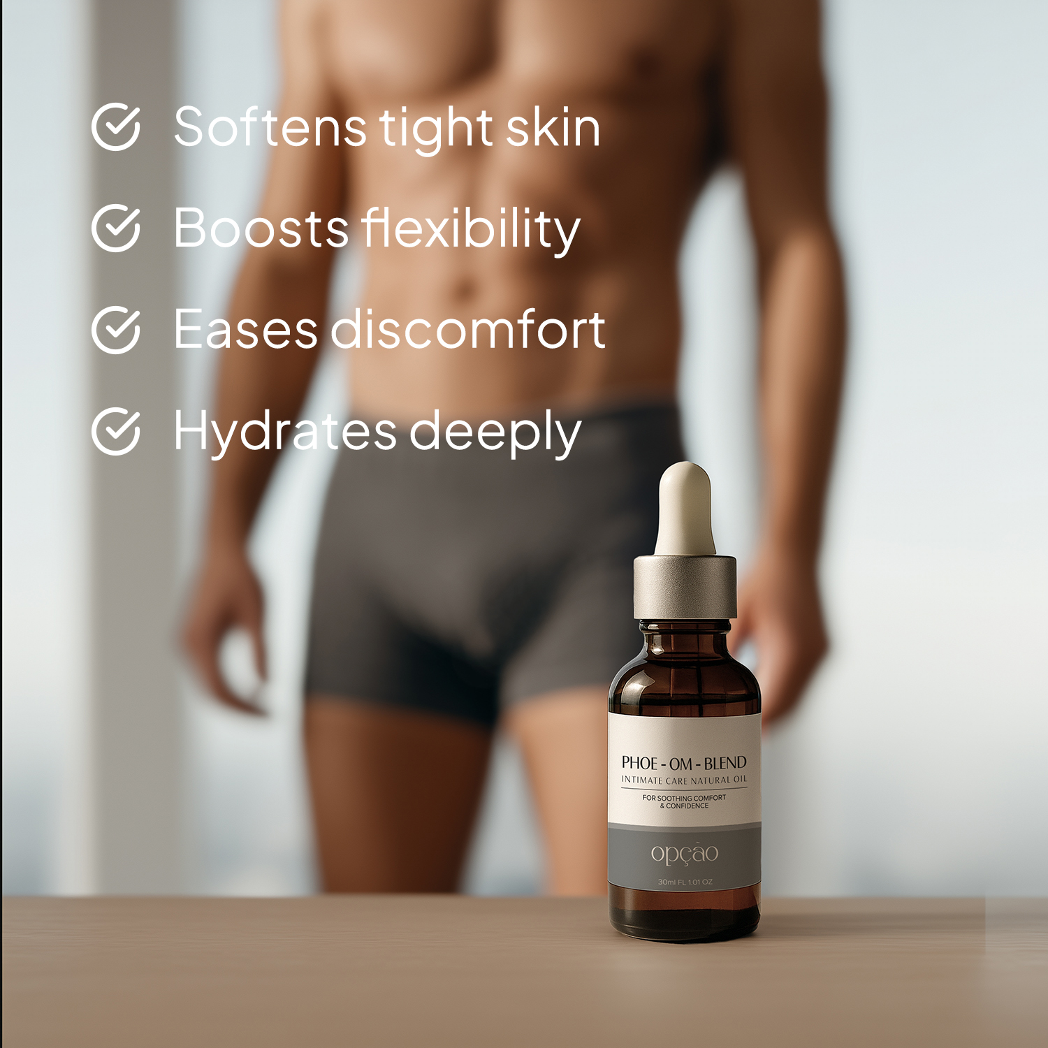
For the website, I developed an art direction centred around confidence, masculinity and everyday wellbeing rather than the medical condition itself.
Lifestyle imagery focuses on relatable men showering, exercising, getting ready or simply going about their day. Darker tones, natural light, water, skin and tactile textures give the imagery a more editorial quality while keeping it grounded in everyday routines.
The aim was to show the outcome the products support — comfort and confidence — rather than visually illustrating the problem.
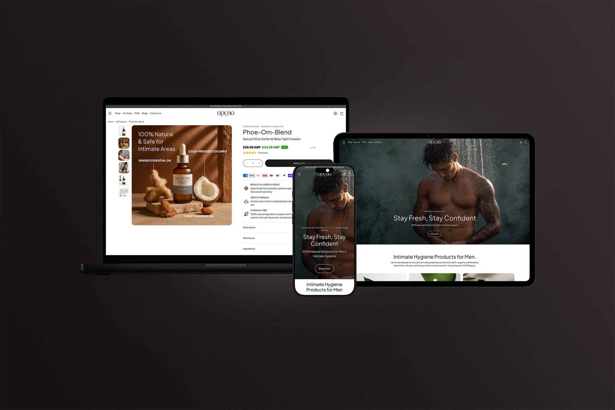
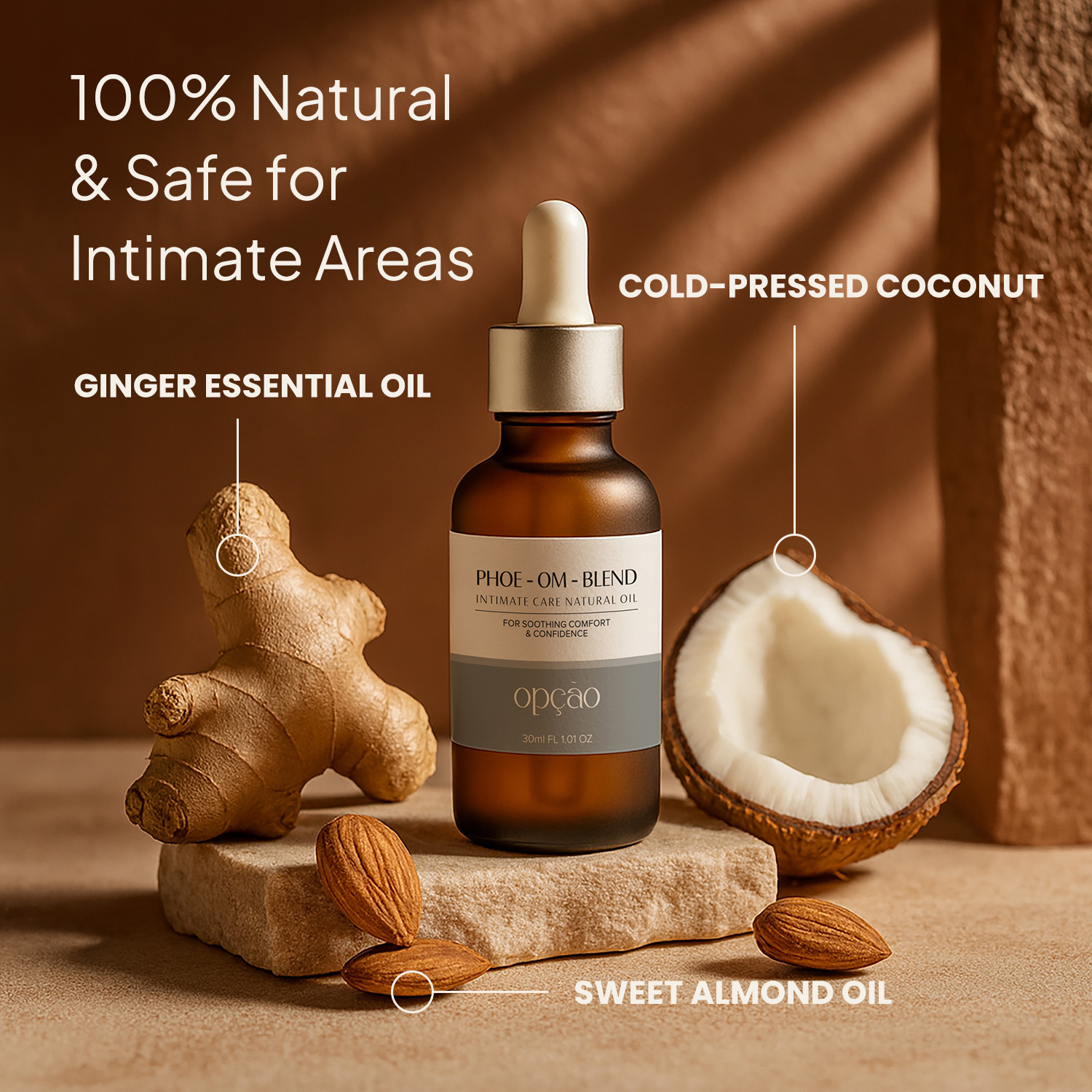
Product imagery followed the same philosophy. Bottles are photographed or generated alongside ingredients including ginger, coconut and almond, using warm natural light, stone and organic textures to communicate the natural formulation while retaining a premium skincare aesthetic.
Where suitable photography wasn’t available, I also created AI-assisted imagery and developed a consistent art direction for generated visuals so they could sit naturally alongside conventional photography rather than feeling obviously synthetic.
Playful, but purposeful
Social media required a very different approach.
Talking about foreskin tightness directly can be awkward, but avoiding the subject completely makes it difficult to reach the people who need the product. It also presents challenges on advertising and social platforms where explicit imagery isn’t appropriate.
Instead, I developed a visual language based around subtle metaphors, humour and familiar everyday objects.
Balloons, bananas and other suggestive-but-innocent objects allow headlines such as “Feeling tight down there?” to communicate the issue immediately without resorting to graphic imagery.
This became the basis of a more confident social style: large typography, minimal compositions, strong photographic concepts and short, conversational messaging.
The humour is deliberately restrained. The aim isn’t to turn the condition into a joke, but to remove some of the embarrassment surrounding it and make starting the conversation easier.
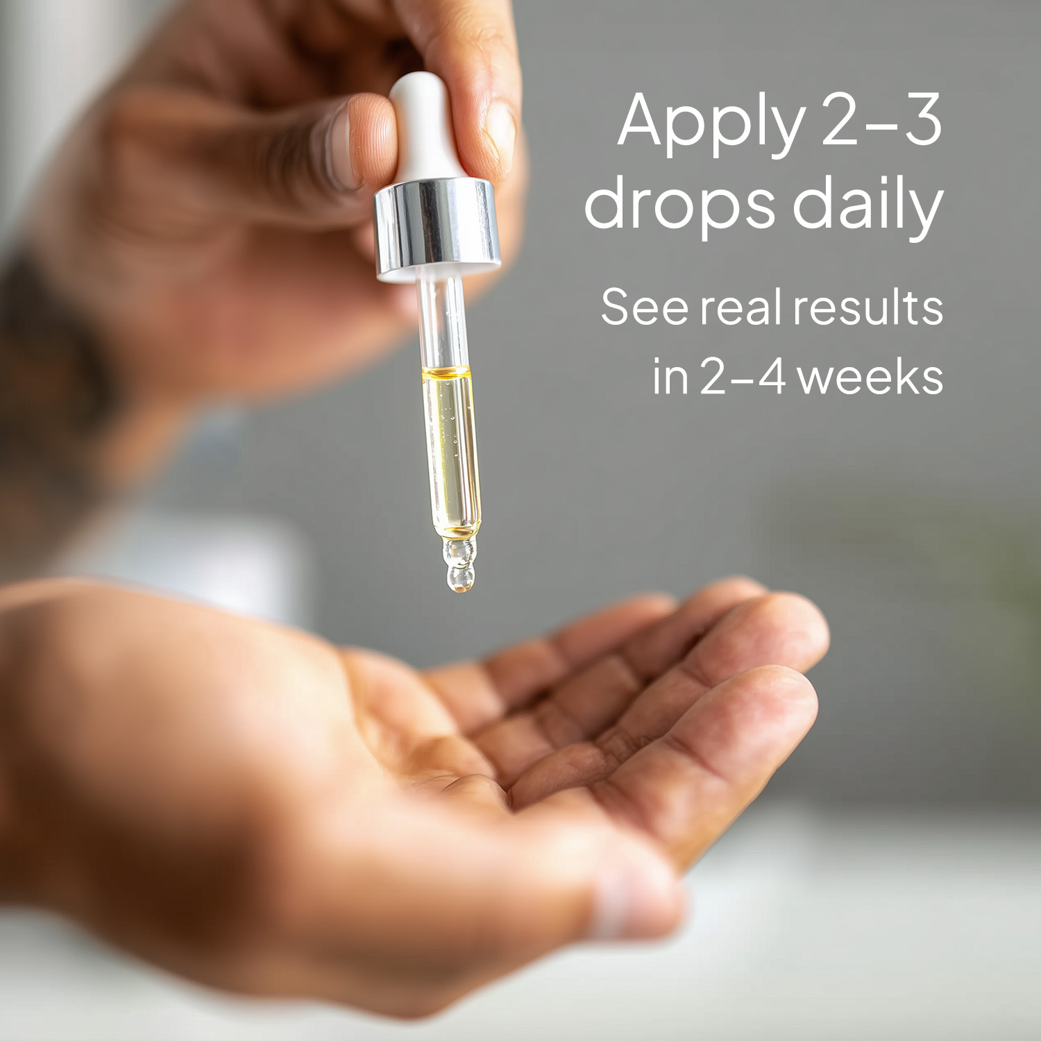
Alongside these campaign-style posts, the social system also includes ingredient graphics, educational content, customer reviews and product-led imagery, giving the brand enough variety to remain useful rather than relying solely on attention-grabbing creative.
Redesigning the ecommerce experience
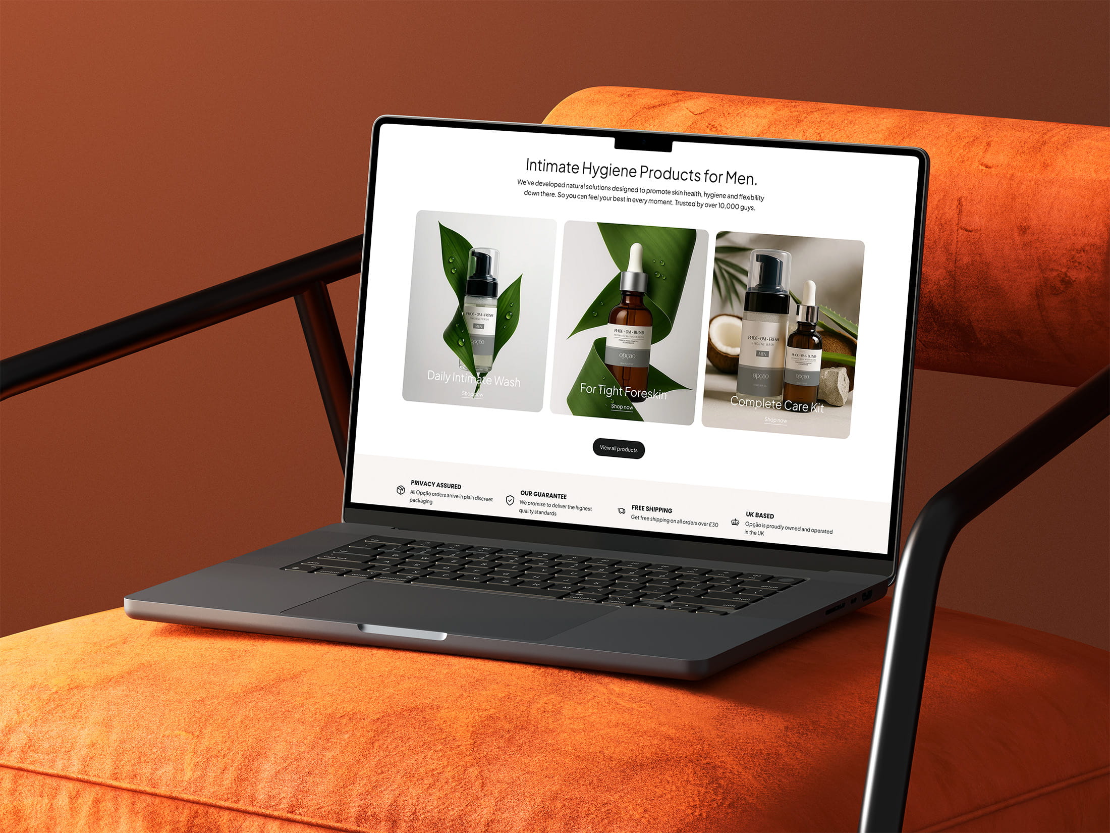
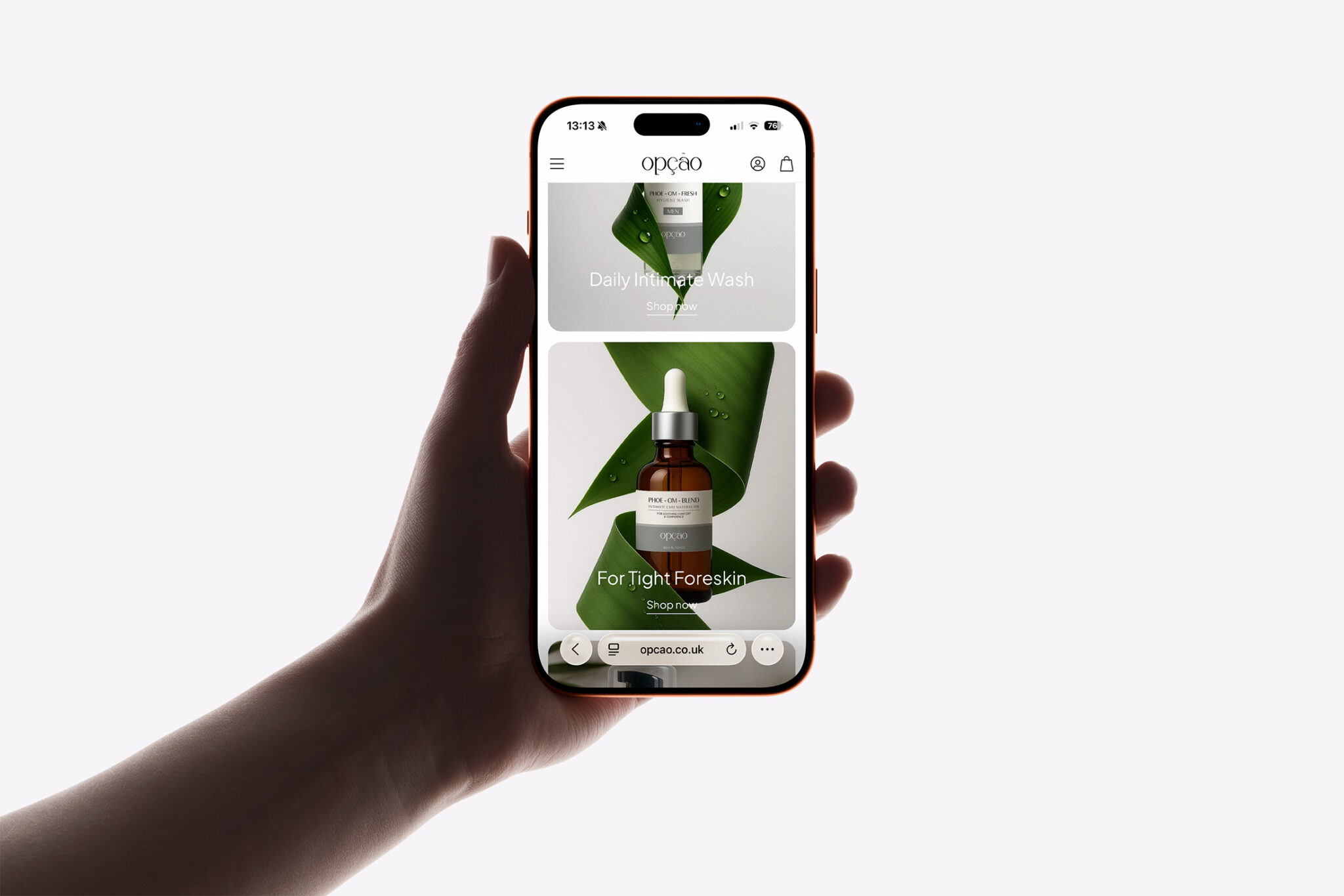
The visual refresh was then translated into a complete redesign of the Opção website.
The previous Shopify site had the foundations of the product offering in place, but the experience felt more like a standard ecommerce template and lacked the distinctive imagery, hierarchy and storytelling required by the brand.
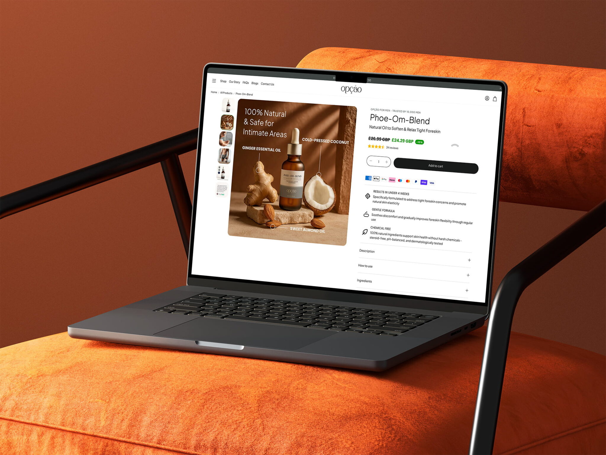
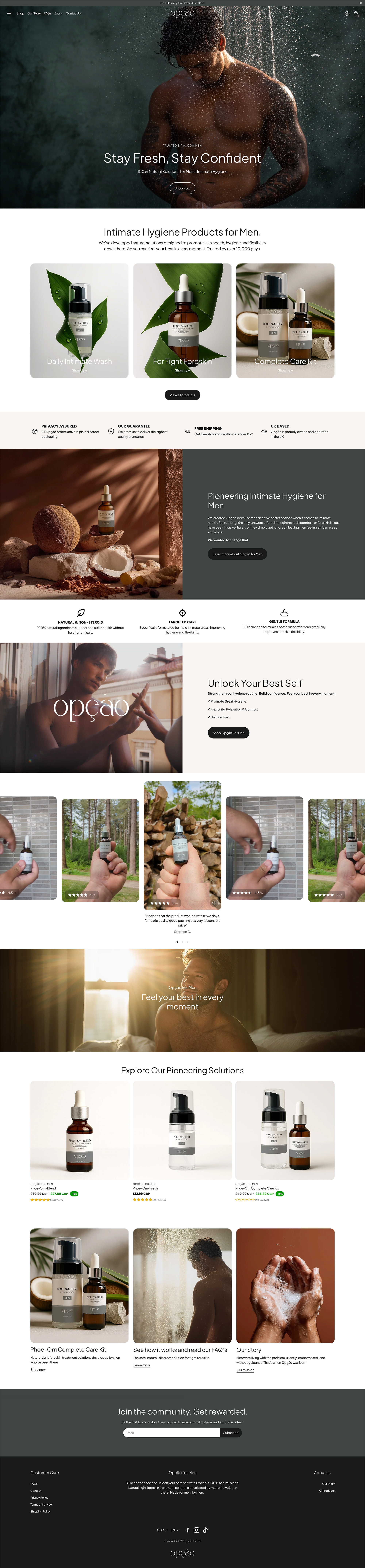
I redesigned the homepage and product experience around a much stronger editorial structure.
Large lifestyle imagery establishes the brand immediately, while product cards, natural ingredient photography, benefit-led content and reassurance messages guide users towards the products without overwhelming them with information.
Because customers may arrive on the website with questions they are uncomfortable asking elsewhere, clarity and trust were particularly important.
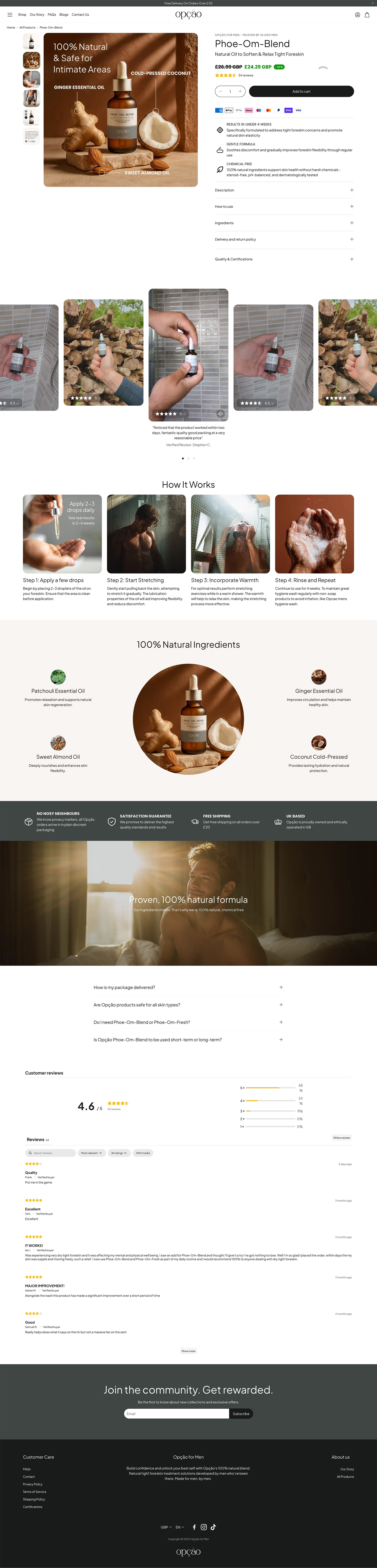
Content explaining what the products are for, how they work, how they fit into a routine and what ingredients they contain is therefore integrated throughout the shopping experience rather than hidden away.
Customer reviews, FAQs, discreet packaging messaging, delivery information and product benefits help address potential objections at the point they are most relevant.
Shopify design and theme customisation
Once the design direction had been established, I customised the existing Shopify theme to bring the new experience to life.
Rather than allowing the limitations of an off-the-shelf theme to dictate the design, the theme was adapted to reflect the refreshed brand as closely as possible.
This included changes to page layouts, typography, colours, image treatments, product presentation, content sections and the overall visual hierarchy of the store.
The result retains the advantages of Shopify for managing products, orders and ecommerce content while giving Opção a significantly more distinctive front-end experience.
Creating one brand across every touchpoint
One of the most important parts of the project was ensuring that the polished website photography, natural product imagery and much bolder social graphics didn’t feel like three separate brands.
The final visual system deliberately allows the tone to change depending on where somebody encounters Opção.
On the website, the brand is calm, considered and reassuring.
In product imagery, it is natural and premium.
On social media, it can be direct, funny and conversation-starting.
Underneath those differences sit the same colours, typography principles, product styling and overall attitude, creating a much more flexible identity while retaining consistency.
For a brand working in a category that many customers may initially feel uncomfortable discussing, that balance was particularly important.
The refreshed Opção identity gives the subject the confidence and maturity it deserves while proving that sensitive healthcare-adjacent products don’t have to look clinical or communicate like them.
Project services
- Brand refresh
- Visual identity development
- Brand guidelines
- Colour and typography systems
- Art direction
- Product image direction
- AI-assisted image generation
- Social media graphic design
- Campaign creative
- Ecommerce UX/UI design
- Shopify website design
- Shopify theme customisation
- Responsive web design