WeThrive
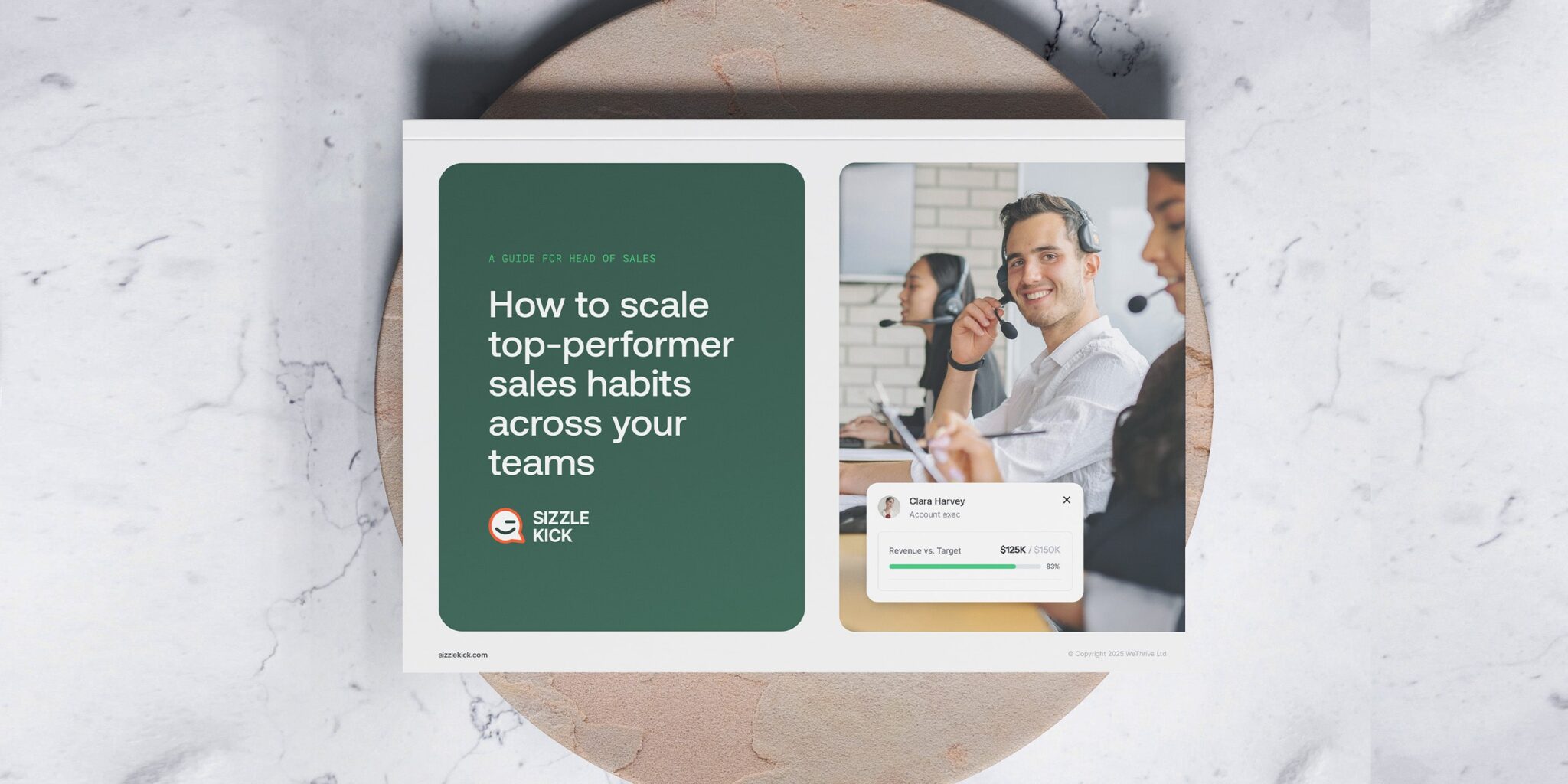
WeThrive produces regular white papers and free resources covering employee engagement, workplace culture and wellbeing.
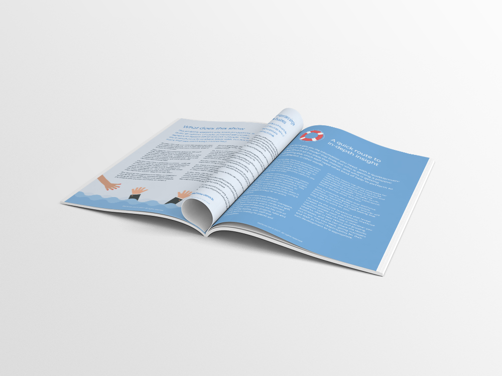
I worked with the team to develop a consistent visual direction for their publications, creating custom illustrations, infographics and layouts that made detailed content more engaging and easier to understand across both print and downloadable PDFs.
Creating a clear visual style
WeThrive needed a more distinctive and consistent approach to its growing library of reports, white papers and marketing materials.
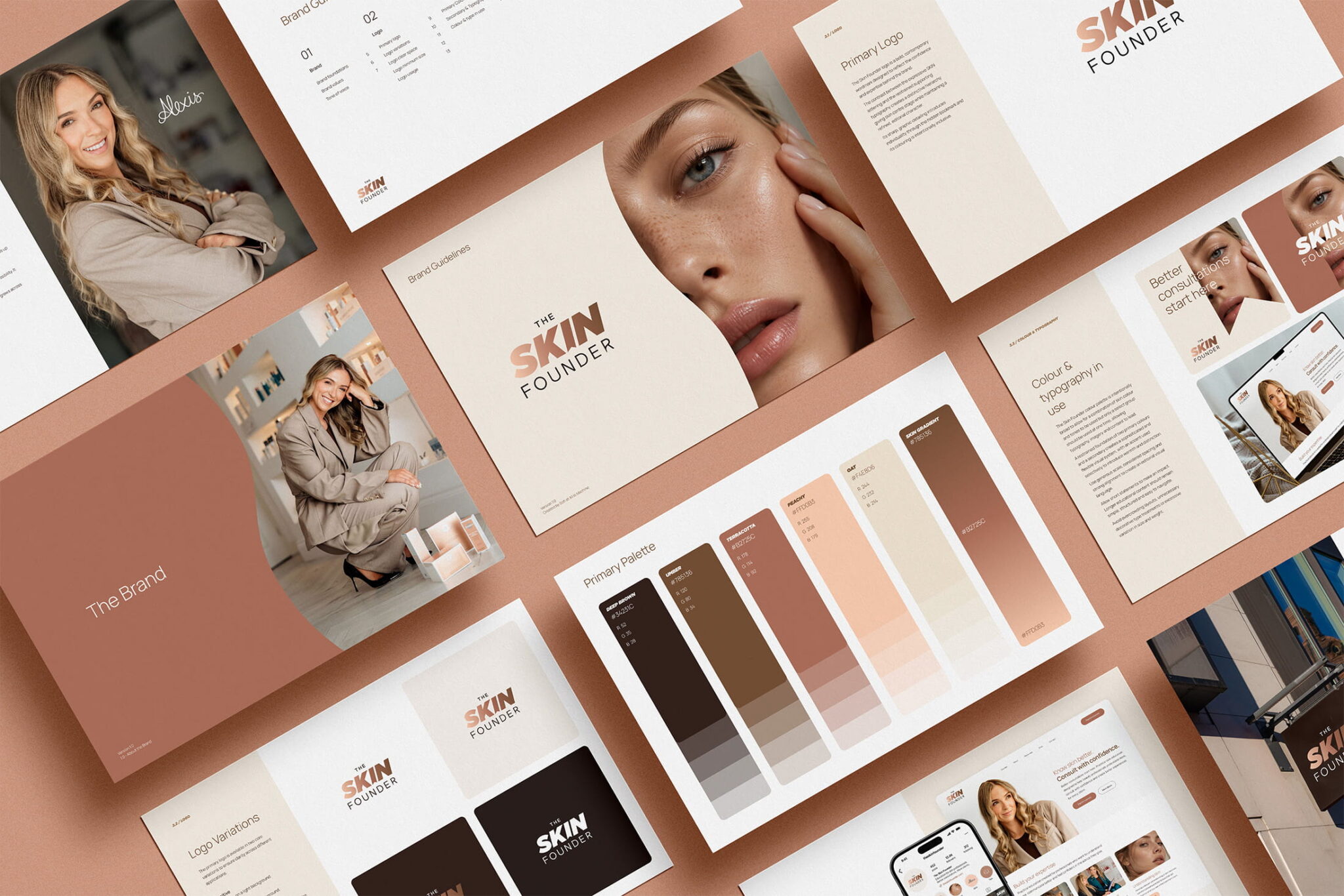
The aim was to create a visual system that could support a wide range of subjects while still feeling recognisably part of the same brand.
Designing for detailed content
The publications often contained research, guidance and data that needed to be presented clearly without feeling too dense.
I developed layouts with strong typographic hierarchy, clear section breaks and varied page structures to help readers move through the content more easily.
This created a better balance between longer-form copy, key statistics and supporting visuals.
Developing custom illustrations
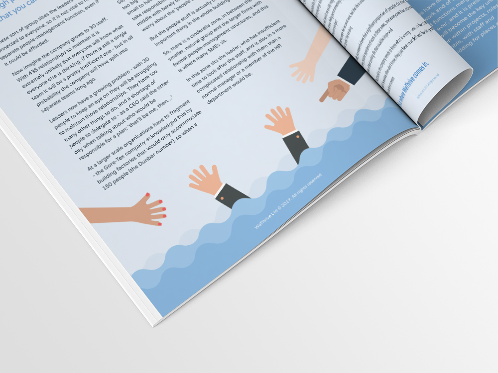
Illustration played an important role in making the resources feel more approachable and engaging.
I created bespoke illustrations that supported the themes of each publication, helping communicate ideas around wellbeing, employee experience and workplace culture in a clear and human way.
The style was designed to be flexible enough to adapt across different topics while remaining consistent with the wider WeThrive identity.
Creating infographics and data visuals
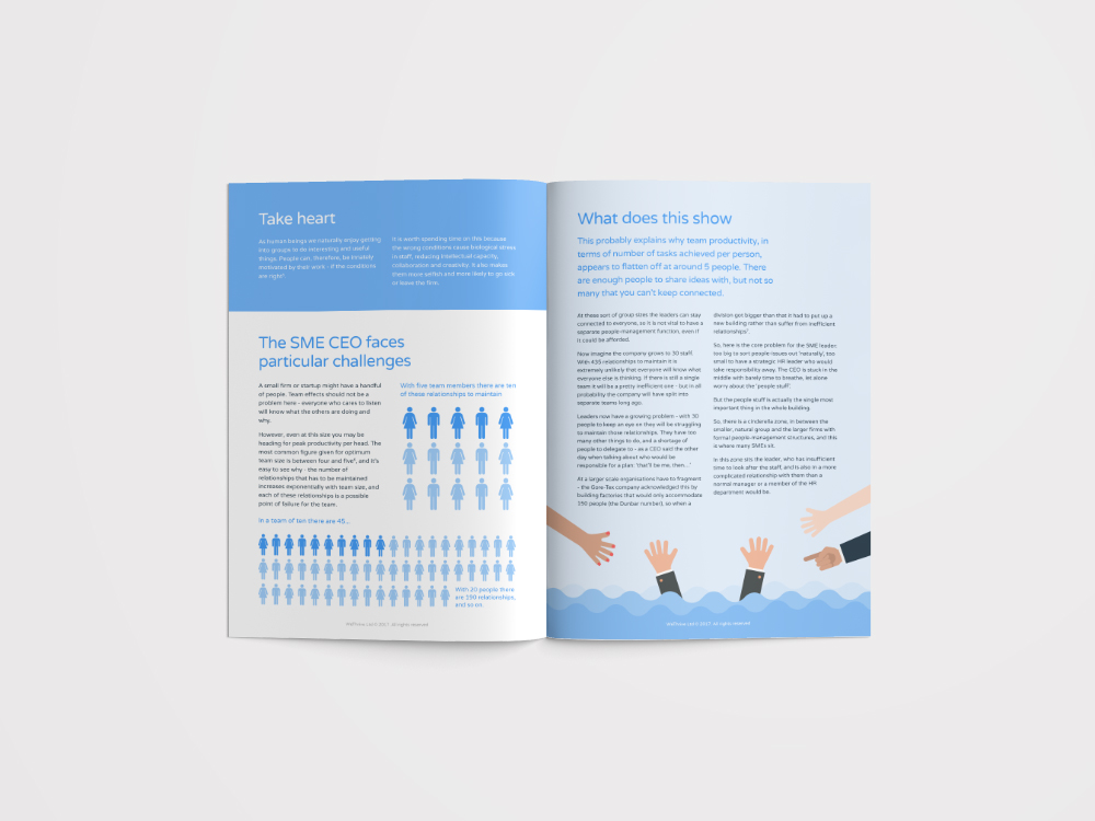
Where the content included statistics, processes or key findings, I designed supporting infographics and diagrams to make the information easier to absorb.
These visuals helped break up heavier sections of text and gave readers clear reference points throughout each document.
Designing for print and digital use
Each publication needed to work both as a printed document and as an online PDF.
I prepared layouts that remained legible on screen while also meeting the technical requirements for professional print production.
This included managing image quality, colour settings, page structure and final artwork for different formats.
Supporting wider marketing materials
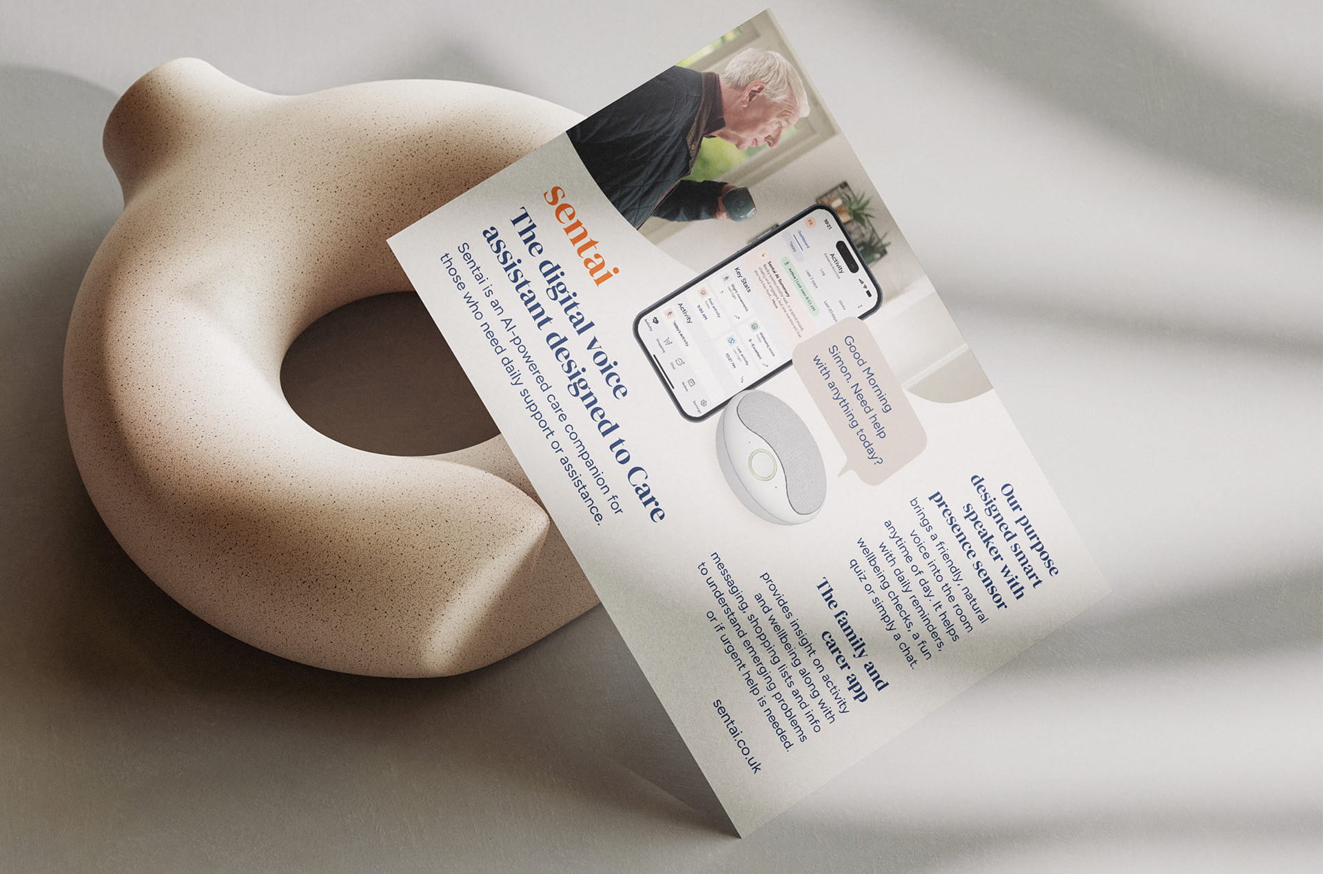
The visual direction developed for the white papers was also carried across related sales and marketing collateral.
Using the same illustration style, typography and graphic treatments helped create a more consistent brand presence across publications, promotional materials and downloadable resources.
Building a repeatable system
Rather than treating each report as a completely separate design project, we developed a flexible system that could be adapted month after month.
This made it easier to introduce new topics while maintaining a recognisable look and feel across the full resource library.

The result
The completed design system gave WeThrive a more polished and consistent way to present its thought leadership and wellbeing content.
The combination of custom illustration, information design and editorial layout helped turn detailed material into clear, engaging resources suitable for both print and online distribution.
Services
- White paper design
- Editorial design
- Illustration
- Infographic design
- Information design
- Print layout
- Digital PDF design
- Marketing collateral
- Sales collateral
Need to turn detailed content into something clearer and more engaging?
I design reports, white papers and supporting visuals that help businesses communicate complex ideas with more clarity and consistency.