United Purpose
The Project
United Purpose was an international charity focused on advancing dignity, empowering communities and creating sustainable change.
Working in collaboration with Good Rebels, I helped evolve the charity’s existing identity through a refreshed logo, distinctive brand symbol and flexible visual system designed for campaigns, communications and global use.
Evolving an established identity
United Purpose needed a brand refresh rather than a complete reinvention.
Its existing identity already carried recognition and trust, but the visual system lacked the clarity and flexibility needed to support a wide range of communications. The aim was to retain the organisation’s established foundations while creating a stronger, more contemporary brand.
Working with Good Rebels
I collaborated with Good Rebels in Brighton as part of the wider rebrand project.
Good Rebels led the strategic messaging and developed key brand statements, including “Beyond Aid” and “We are united in our purpose to move people beyond aid.” My role focused on developing the logo and translating the direction into a clear, consistent visual identity.
Refining the logo
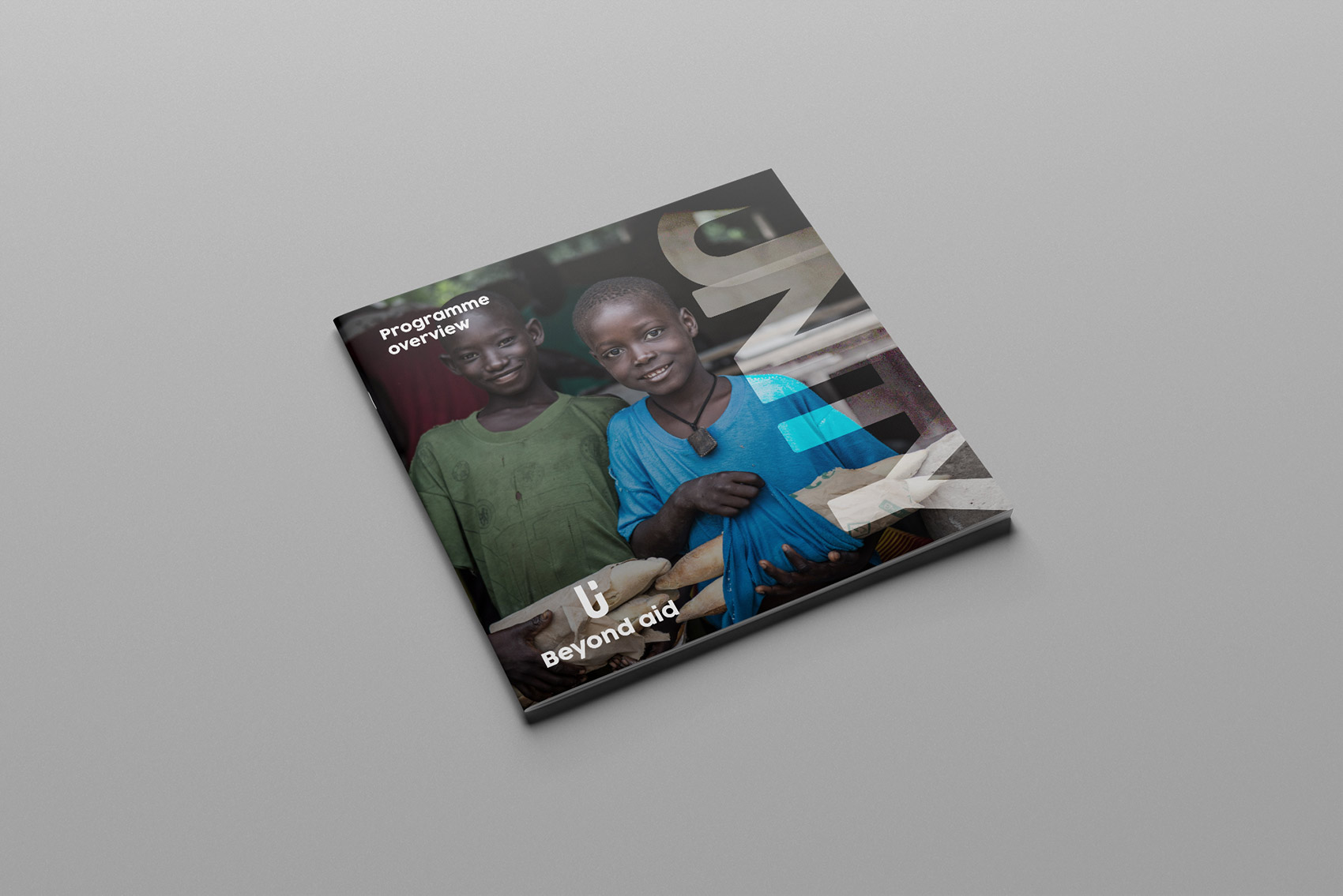
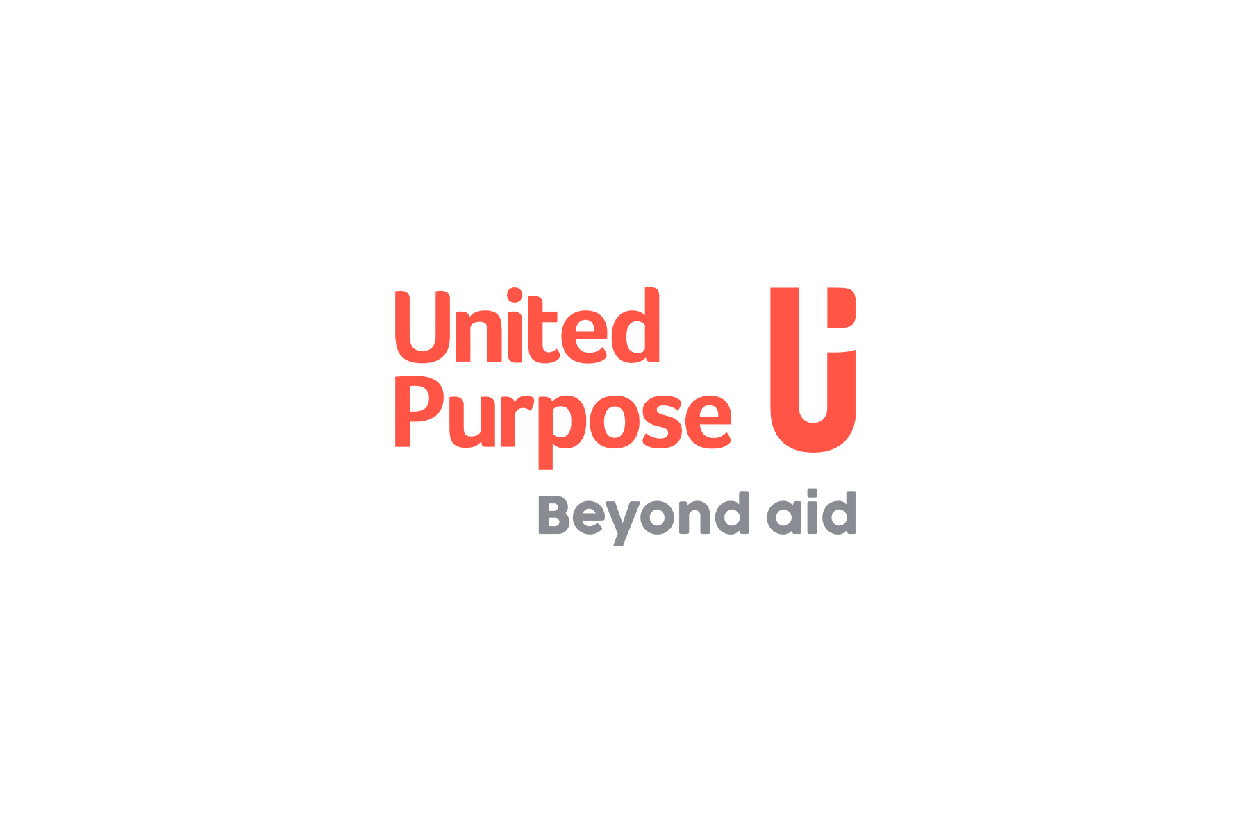
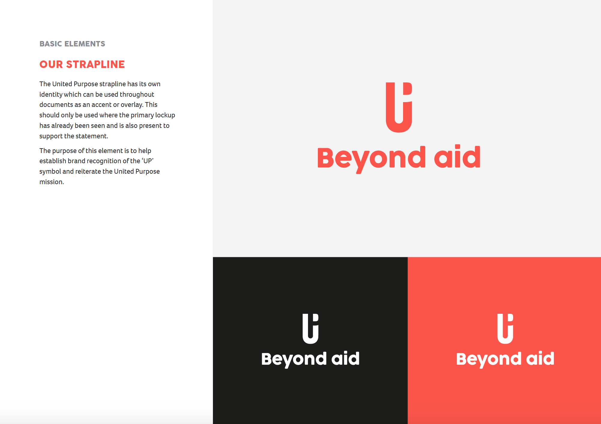
The existing logo was evolved into a cleaner and more confident identity, combining a structured wordmark with a distinctive standalone symbol.
The updated mark was designed to suggest movement, progress and positive change, reflecting United Purpose’s focus on enabling people and communities to thrive beyond aid.
The logo system was refined to improve:
- clarity and legibility
- cohesion between the symbol and typography
- scalability across different formats
- flexibility for campaign and organisational use
- recognition when the symbol was used independently
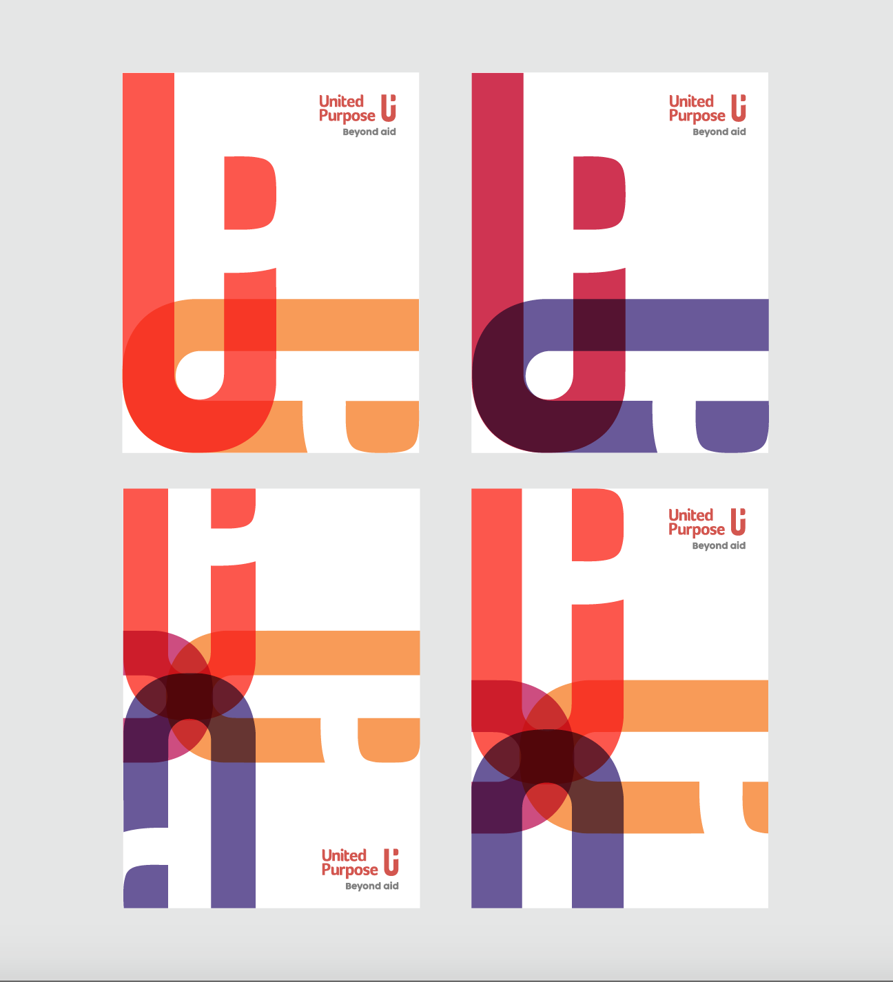
Creating a flexible visual system
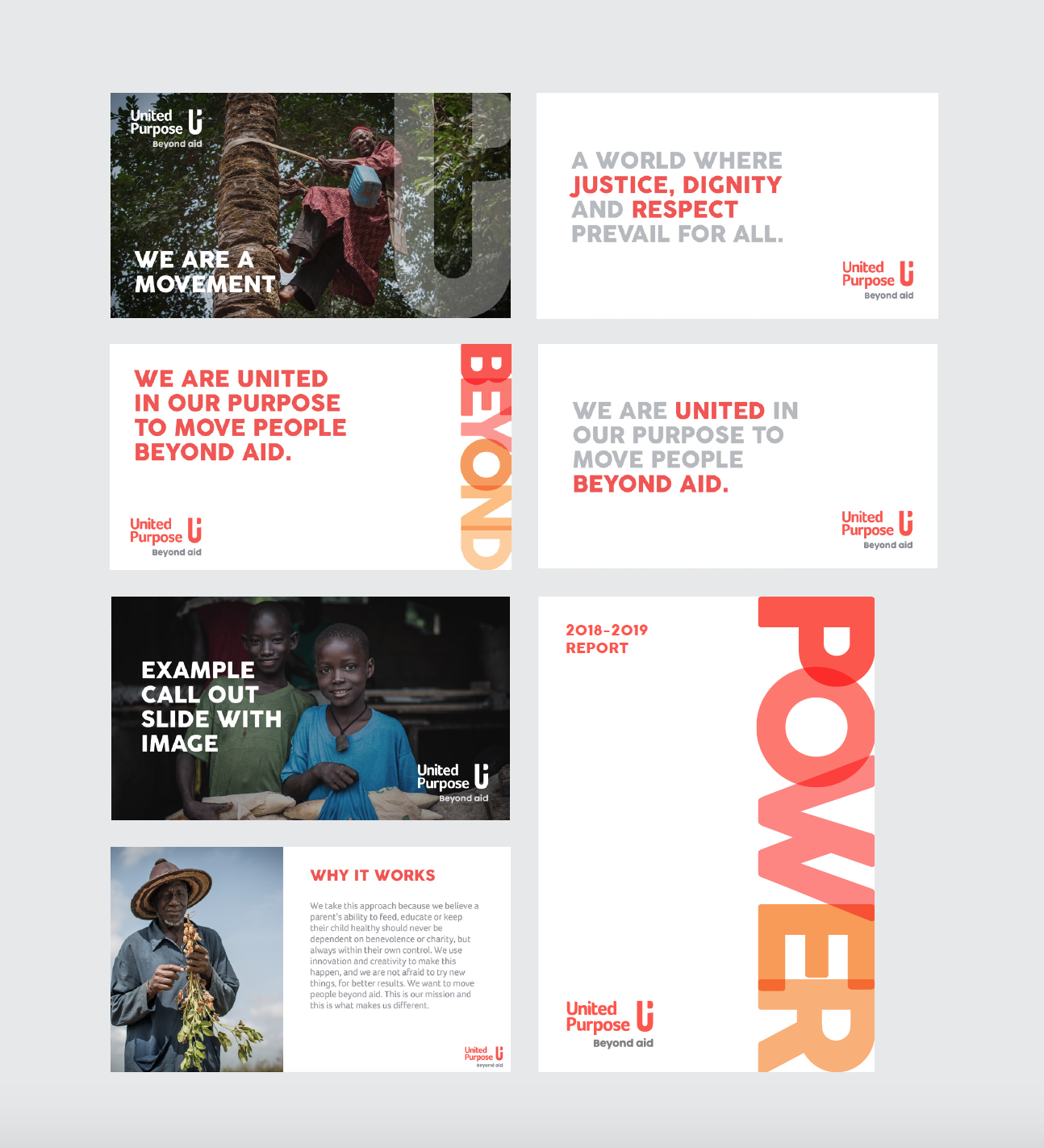
The wider identity was developed around clarity, impact and accessibility.
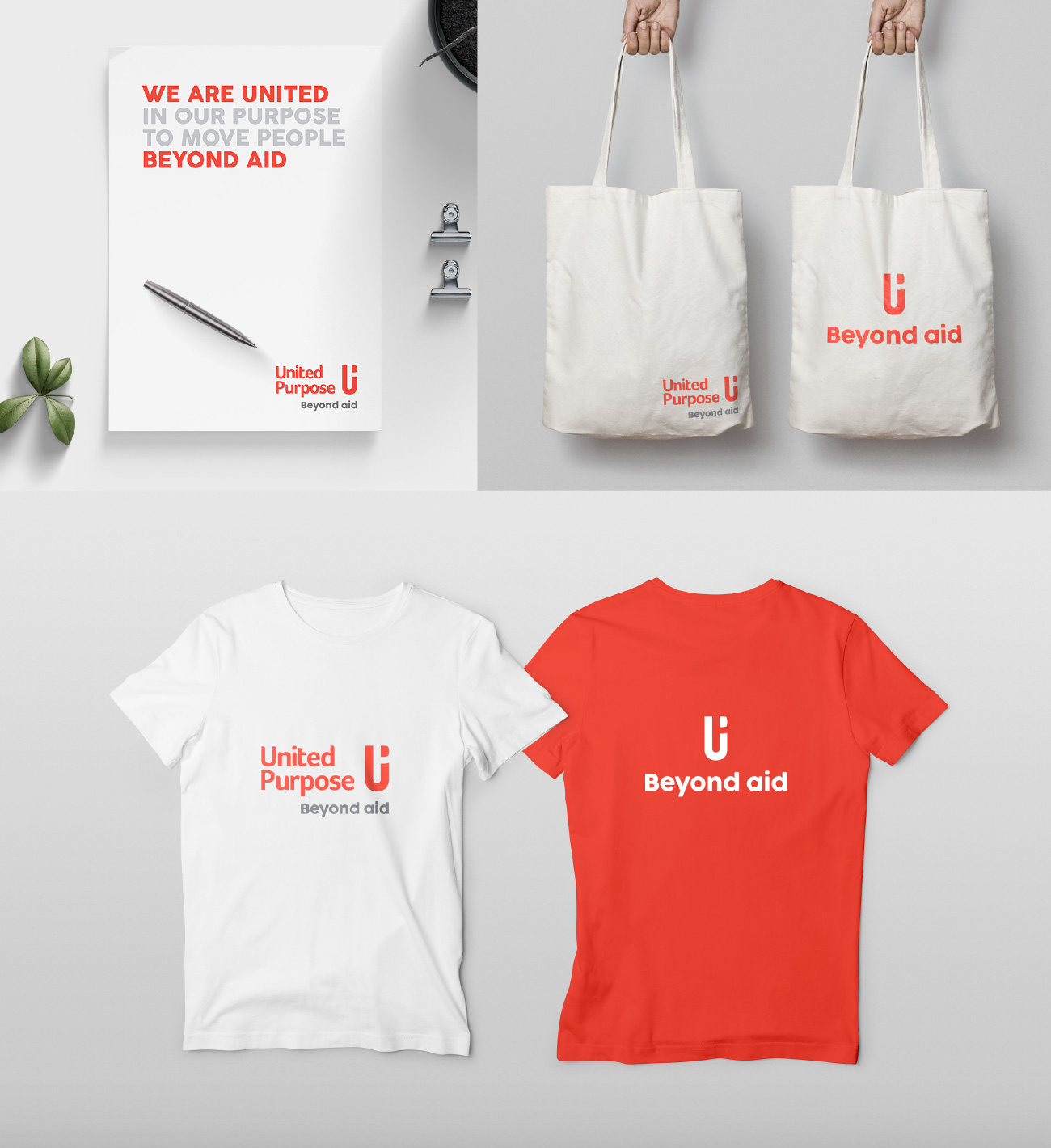
A strong typographic hierarchy supported bold statements and important campaign messages, while a refined palette of energetic reds and warm neutrals gave the organisation a more unified and recognisable visual presence.
The system was designed to accommodate both emotive campaign communications and more formal organisational materials.
Bringing the messaging to life
The new brand statements played an important role in defining the identity.
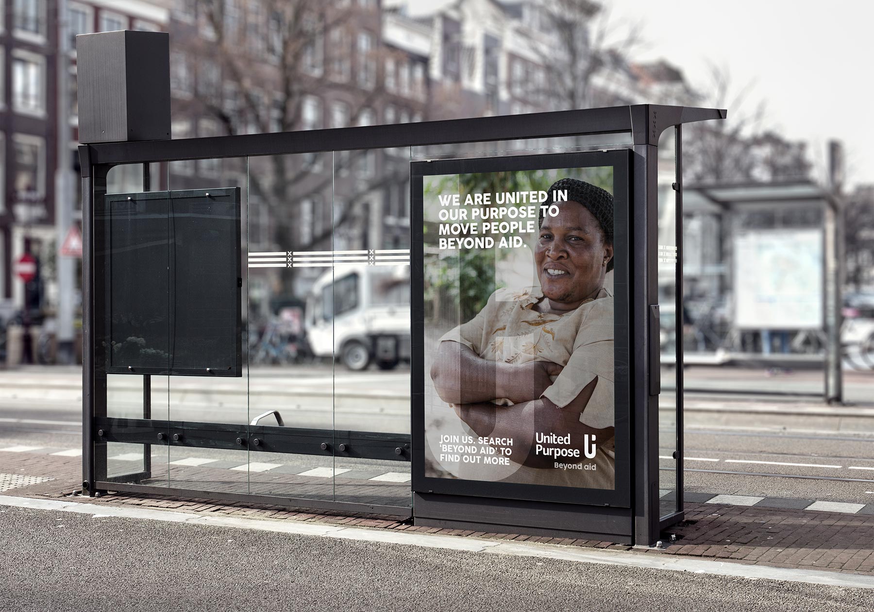
Rather than presenting communities through traditional charity-led narratives, the messaging focused on dignity, empowerment and shared purpose. I integrated these statements into layouts and applications, using scale, contrast and typography to give them a confident visual voice.
Designing across multiple touchpoints
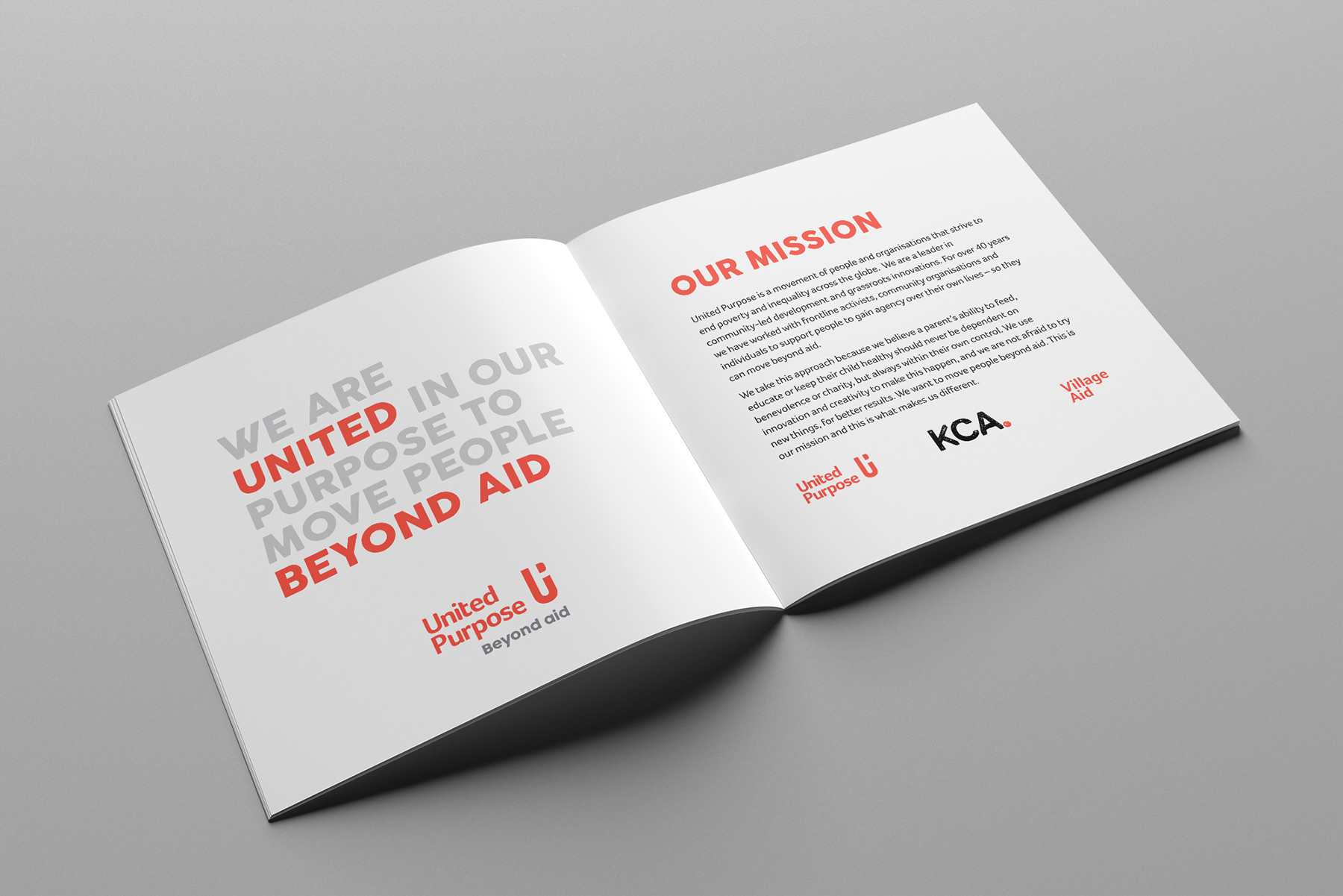
The refreshed identity was developed to work consistently across printed, digital and physical applications.
This included concepts and assets for:
- brochures and information booklets
- outdoor and campaign advertising
- tote bags and branded clothing
- stationery and business materials
- social media graphics
- digital layouts and interface elements
- internal documents and presentations
Testing the identity across these applications helped ensure it remained recognisable and effective at different sizes and in different contexts.
The result
The completed identity gave United Purpose a clearer, more professional and more memorable brand presence.
The refreshed logo, stronger messaging and flexible visual system provided a consistent foundation for communicating the organisation’s mission across campaigns, platforms and international audiences.
The project demonstrated how an established charity identity could be carefully evolved without losing the recognition and trust it had already built.
Services
- Logo development
- Brand identity design
- Visual identity system
- Typography and colour development
- Campaign design
- Print collateral
- Merchandise concepts
- Digital brand applications
- Agency collaboration
Does your organisation need to evolve its identity without losing what people already recognise?
I help charities, organisations and purpose-led businesses refresh their brands with clear, flexible visual systems that communicate their work with confidence and consistency.