Osain Organics
The project
Osain Organics was created as a new organic beauty brand with plans to launch a range of naturally focused products.
I developed the logo and wider visual identity, creating a clean and approachable brand system designed to work across packaging, printed materials and future marketing.
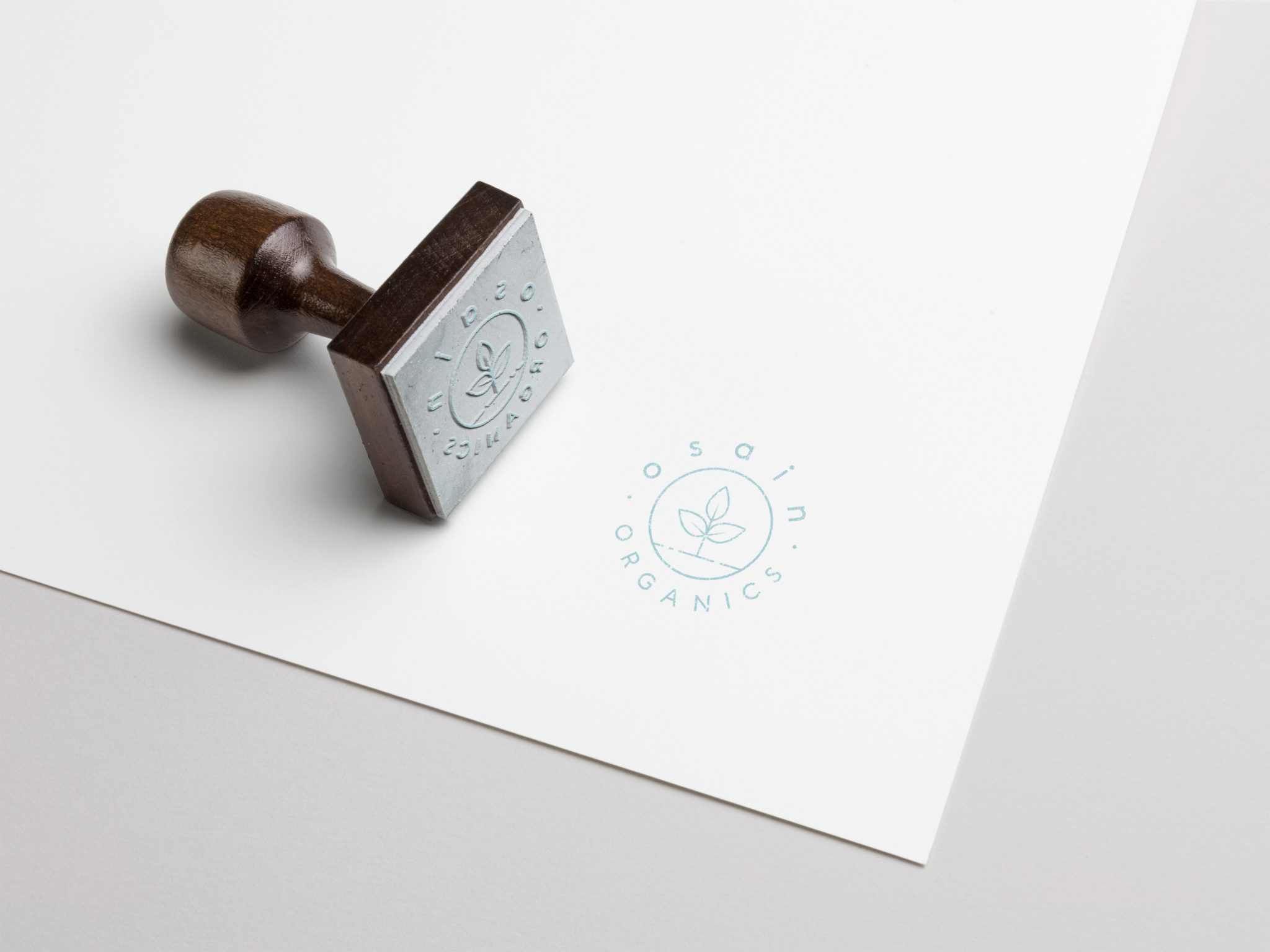
Creating an identity for a new beauty brand
Osain Organics approached me at the early stages of the business, before the product range had launched.
The brand needed a clear and recognisable identity that could introduce the company, communicate its organic positioning and provide a consistent foundation for packaging and promotional materials.
Balancing natural and contemporary
The visual direction needed to feel connected to nature without becoming overly rustic or relying on predictable handmade styling.
I developed a cleaner, more contemporary approach using restrained typography, soft colour and a simple botanical symbol. This helped the identity feel fresh and credible while retaining the warmth expected from an organic beauty brand.
Developing the logo symbol
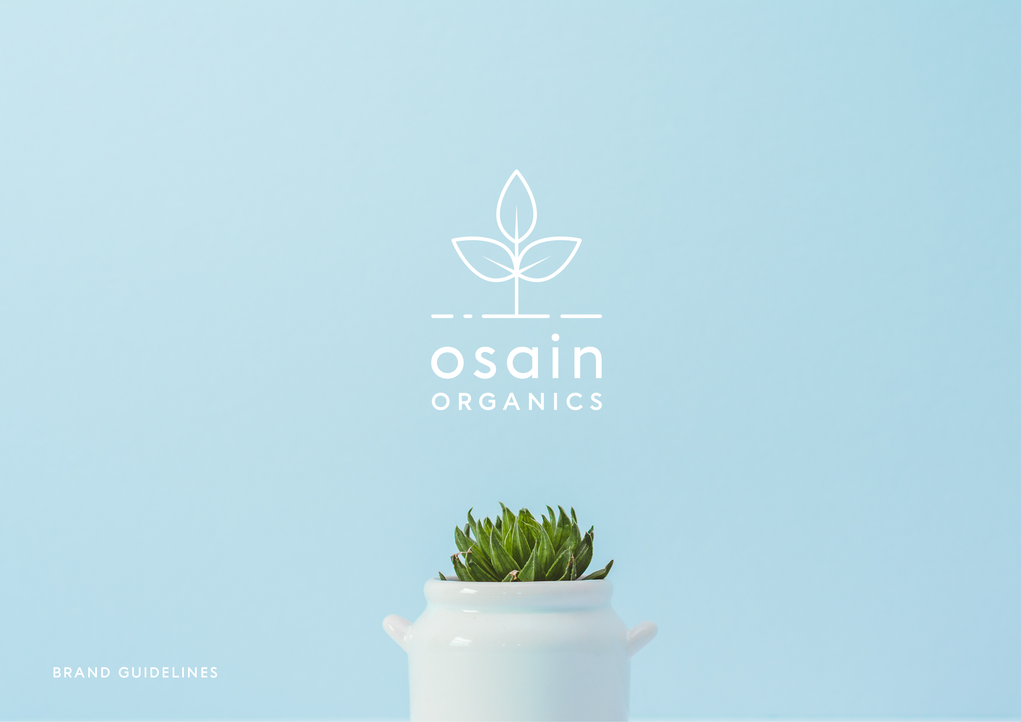
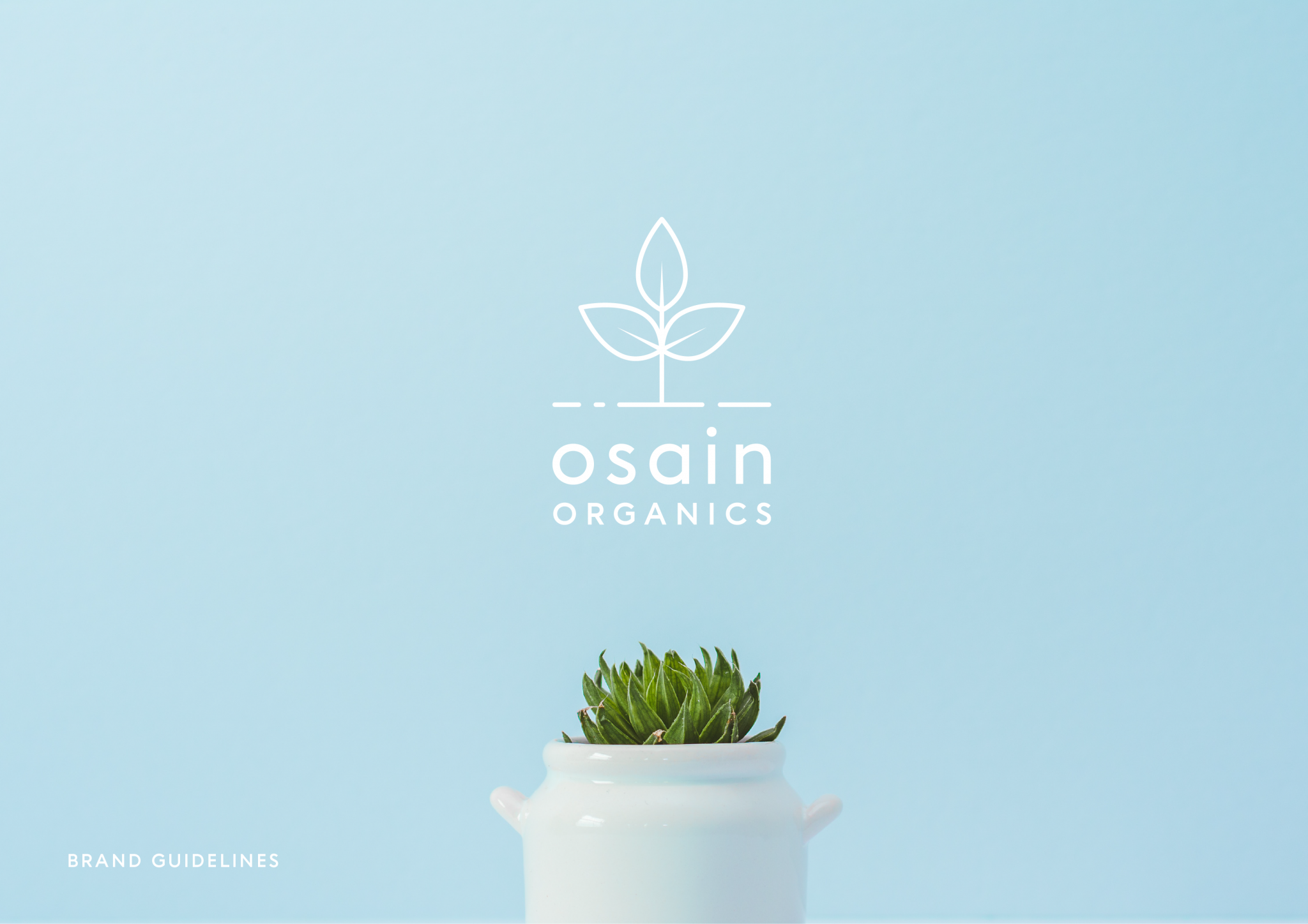
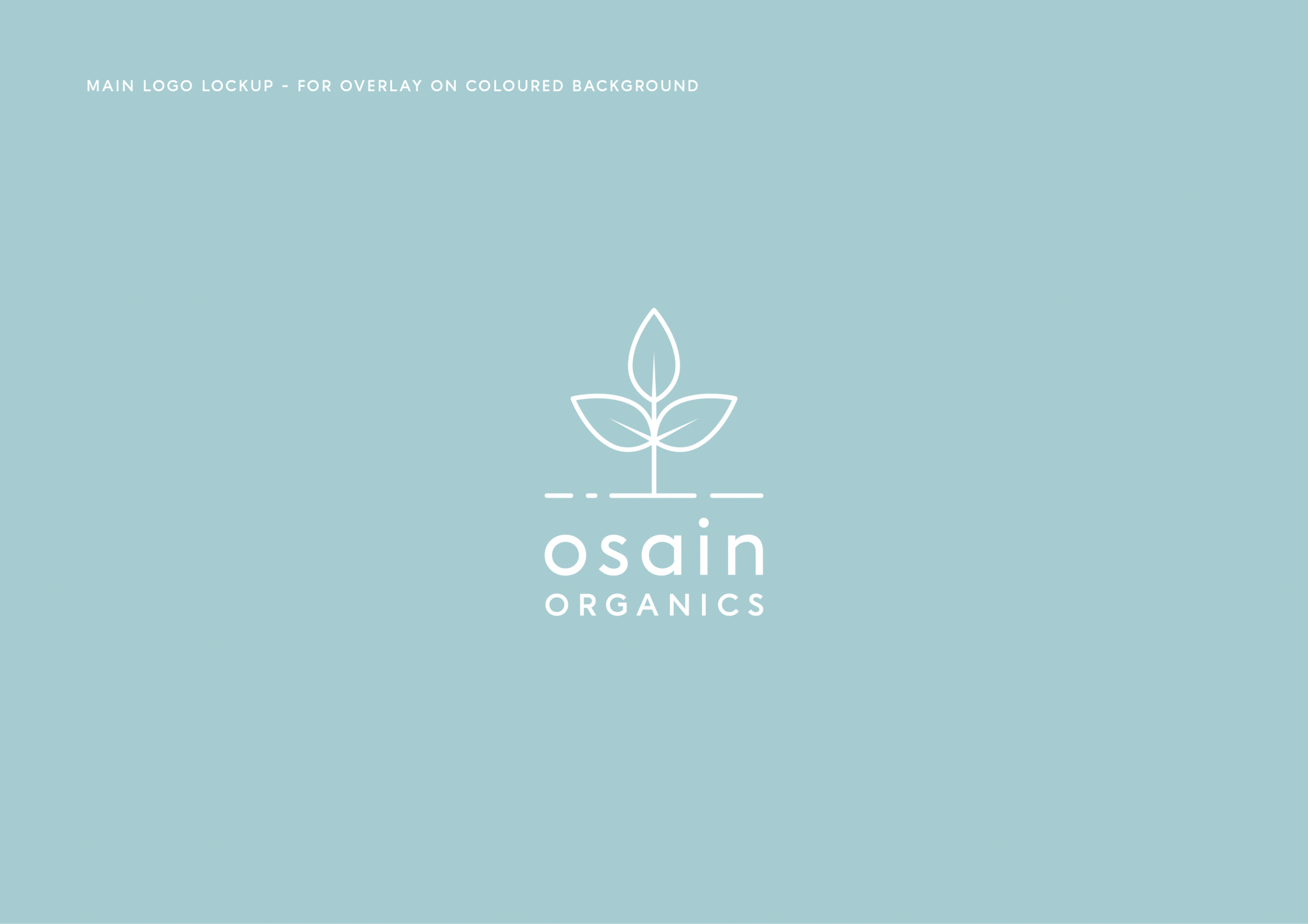
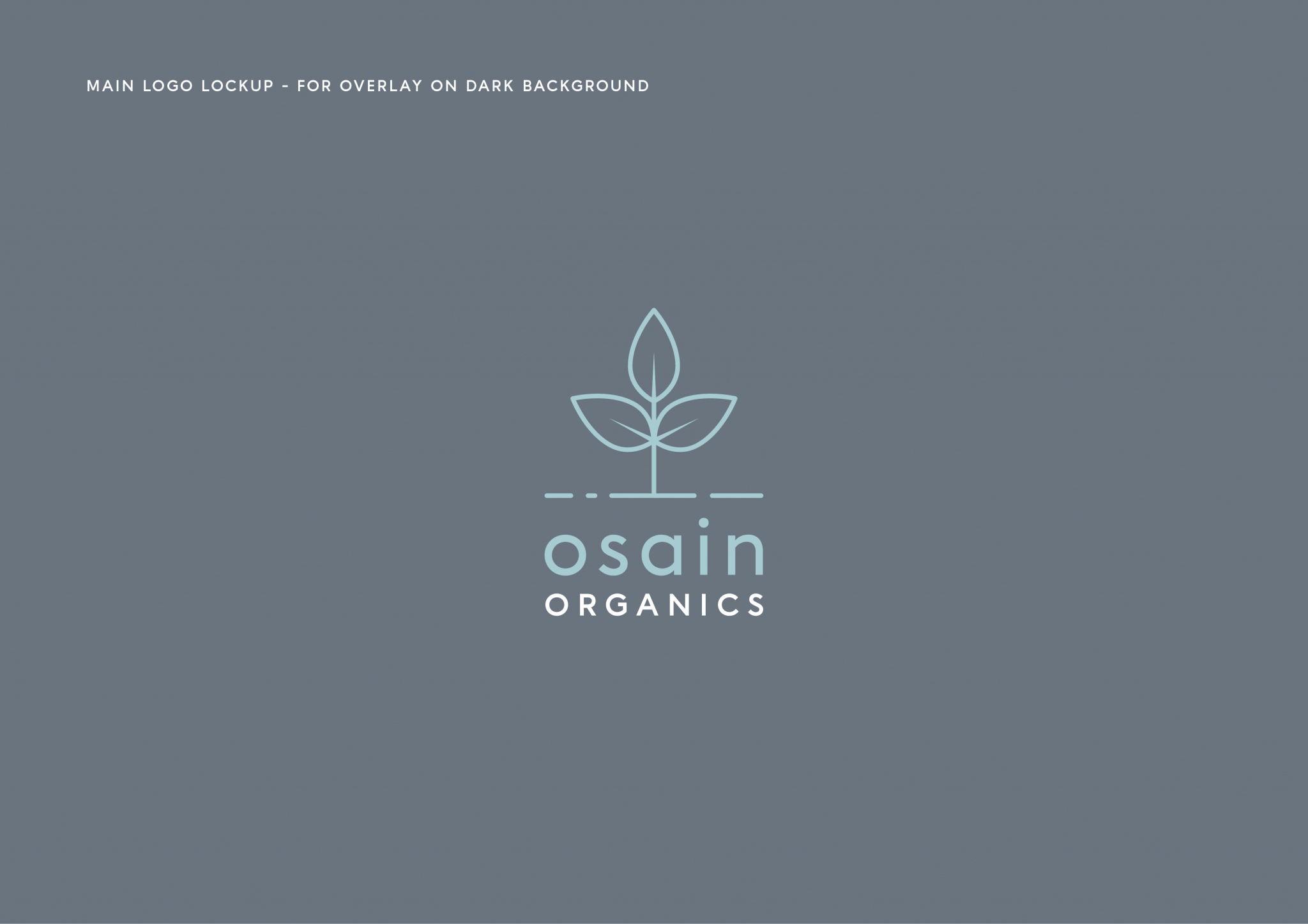
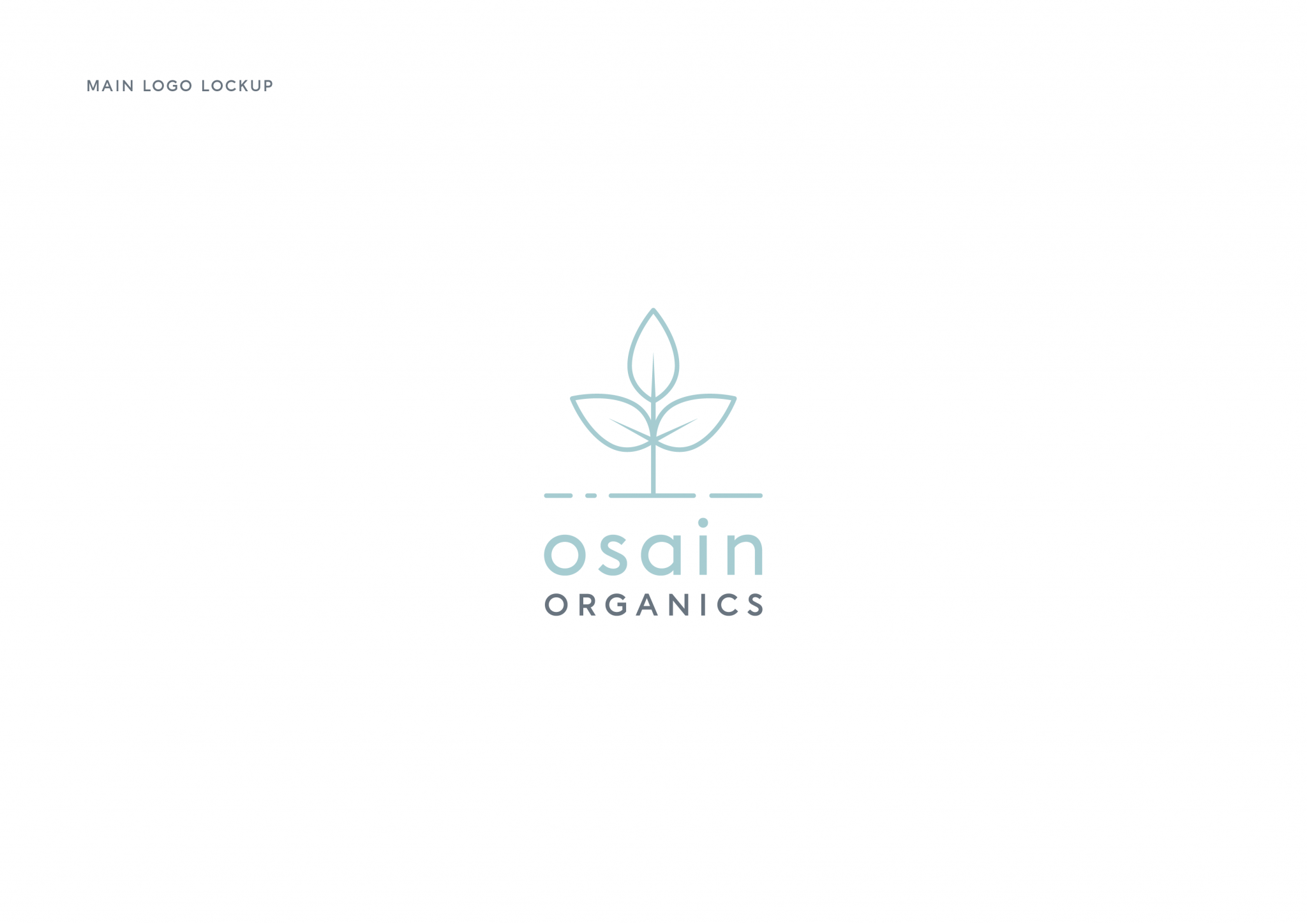
The central logo mark is built around a stylised three-leaf plant.
The symmetrical structure gives the symbol balance and clarity, while the fine line treatment keeps it light and refined. The mark creates an immediate connection to growth, plant-based ingredients and natural care without illustrating a specific product.
Its simple construction also allows it to work independently from the wordmark across smaller applications.
Typography and wordmark
The Osain name is set in a clean lowercase type style, giving the identity a softer and more approachable character.
Generous spacing and simple letterforms help the wordmark feel modern and considered, while the uppercase “Organics” descriptor creates a clear secondary level within the logo hierarchy.
Together, the symbol and typography create a logo that feels natural without losing a professional finish.
Creating a soft colour palette
A pale blue was selected as a key brand colour, supported by white and natural green imagery.
The blue gives the identity a sense of calm, cleanliness and freshness, helping it stand apart from the earthier greens and browns commonly used within organic branding.
This palette also provided a flexible background for product photography, packaging and digital content.
Developing the wider brand system
Alongside the main logo, I created supporting brand guidance to help Osain Organics apply the identity consistently.
This included direction for logo use, colour, typography and image styling, giving the business a practical reference for future packaging and marketing work.
The system was designed to be simple enough for everyday use while allowing the brand to expand as new products were introduced.
Designing for packaging and promotion
The identity needed to remain clear across a range of possible product formats and sizes.
The botanical mark could be used as a prominent packaging feature or as a smaller seal, while the clean wordmark provided enough flexibility for labels, boxes, social content and printed promotional materials.
The restrained visual language helped keep the focus on the product and its natural ingredients.
The result
The completed identity gave Osain Organics a calm, recognisable and professional foundation for launch.
The combination of botanical symbolism, minimal typography and a soft colour palette created a brand that felt organic and approachable while still being polished enough for the beauty market.
Client feedback
“Sofi at All is Machine is professional, efficient and has an incredible attention to detail. After a few unsuccessful branding sessions with other designers, I was nervous about approaching another, but Sofi put me at ease instantly. She really understood my vision and delivered a branding package that exceeded my expectations.
On top of this, Sofi has a lovely nature and is willing to go above and beyond to ensure you are happy with the finished result. Osain Organics has found its go-to graphic designer.”
Ella Nyakuedzwa-Smith, Osain Organics
Services
- Logo design
- Brand identity development
- Botanical symbol design
- Wordmark development
- Colour palette
- Typography selection
- Brand guidelines
- Packaging design direction
- Marketing asset direction
Launching a beauty, skincare or wellness brand and need an identity that feels natural without looking generic?
I create clear and considered brand systems that give new products a professional foundation across packaging, print and digital marketing.