LaGrange Holdings
The project
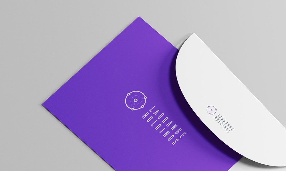
LaGrange Holdings approached me to develop a distinctive logo and visual direction for a business operating within the cryptocurrency and technology space.
The final concept combines a geometric network symbol with a condensed wordmark, creating an identity that feels technical, progressive and recognisable across light and dark applications.
Turning the name into a visual system
The LaGrange name offered an opportunity to create an identity rooted in mathematics, movement and interconnected systems.
Rather than relying on familiar cryptocurrency imagery, I explored a more abstract direction based on nodes, orbital paths and geometric relationships.
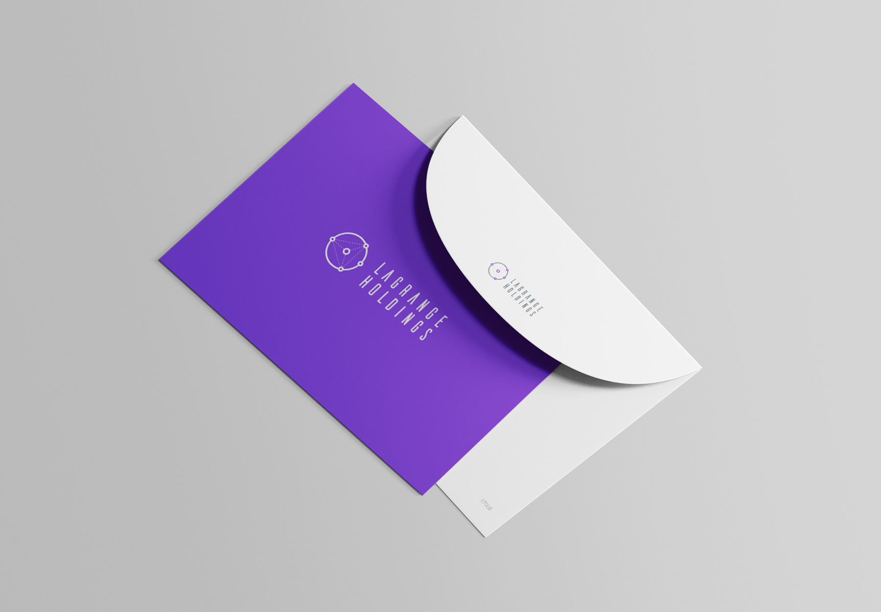
Developing the symbol
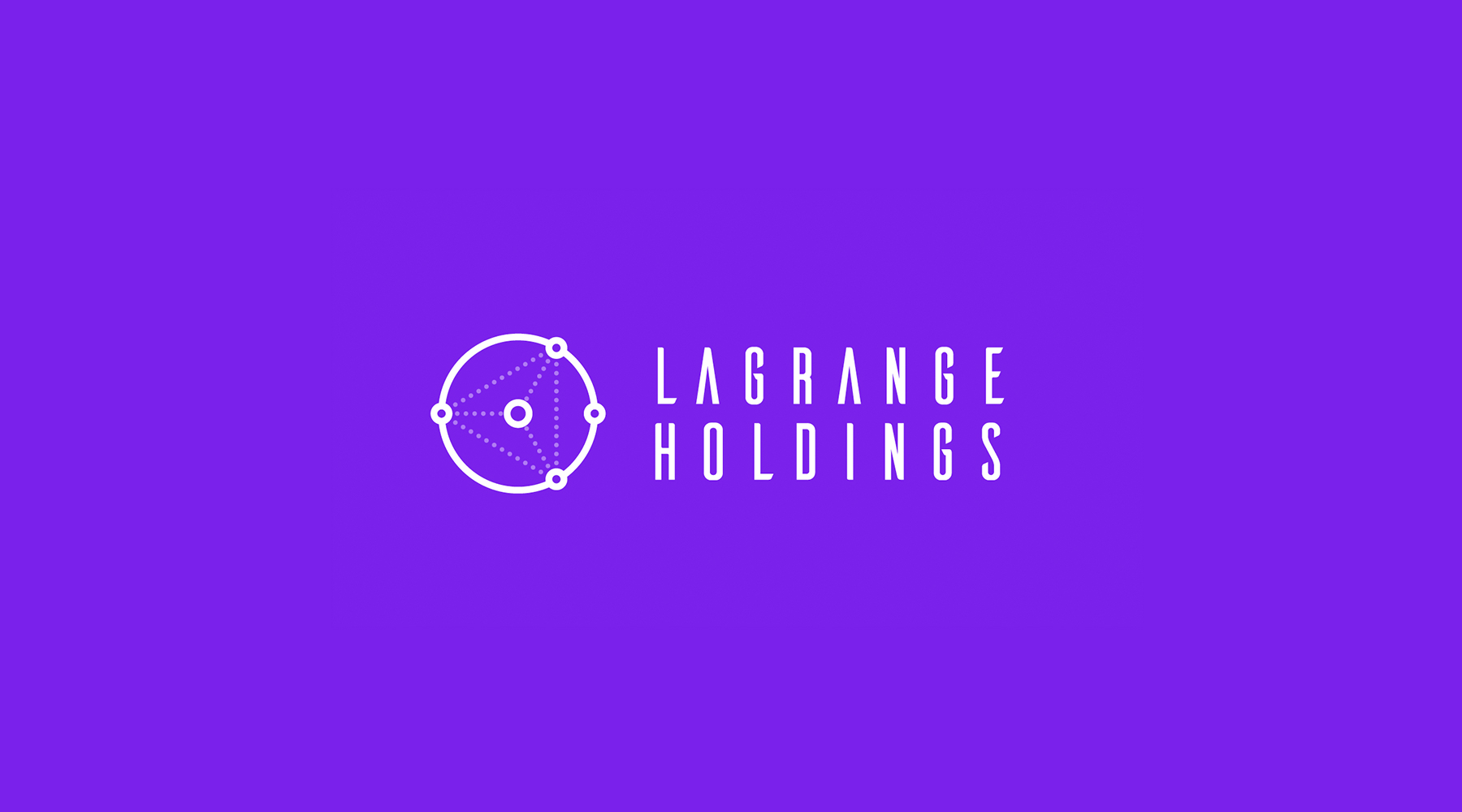
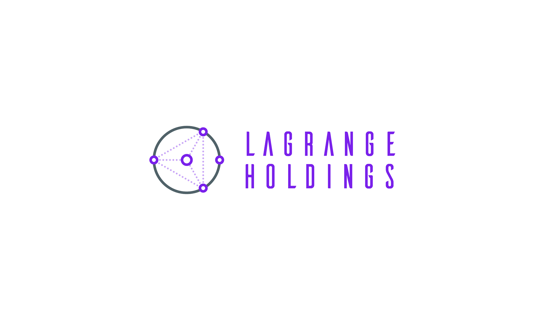
The final mark is constructed around a circular framework containing a series of connected points.
The outer ring suggests an orbit, system or wider network, while the internal dotted lines connect multiple nodes back to a central point. This creates a visual reference to distributed technology, data movement and connected digital infrastructure.
The asymmetrical node placement gives the symbol a sense of motion while retaining a clear and balanced silhouette.
Typography and wordmark
The wordmark uses a tall, condensed typeface with generous letter spacing.
This creates a modern and technical feel while giving the longer company name enough presence without becoming visually heavy. The stacked arrangement keeps the logo compact and allows the symbol and wordmark to feel balanced as a single lock-up.
Colour direction
A vivid purple was selected as the primary brand colour, helping the identity feel energetic, digital and contemporary.
The darker grey provides structure and contrast in the full-colour version, while the reversed white logo creates a bold and highly visible treatment on purple backgrounds.
Flexible logo applications
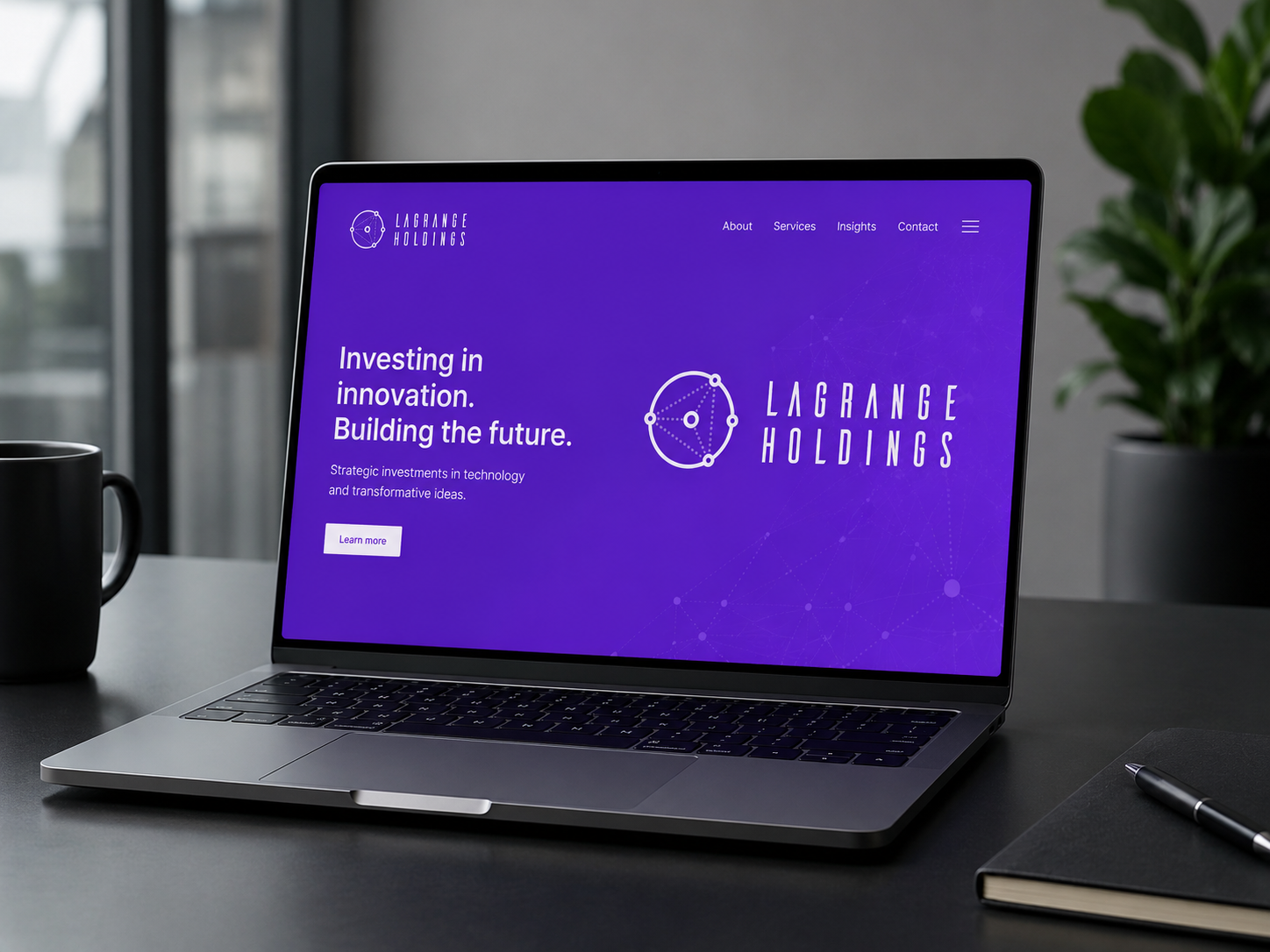
The logo was developed in both full-colour and reversed formats so it could work across different digital and corporate settings.
The symbol is also strong enough to be separated from the wordmark for smaller applications such as profile images, favicons, interface icons or social graphics.
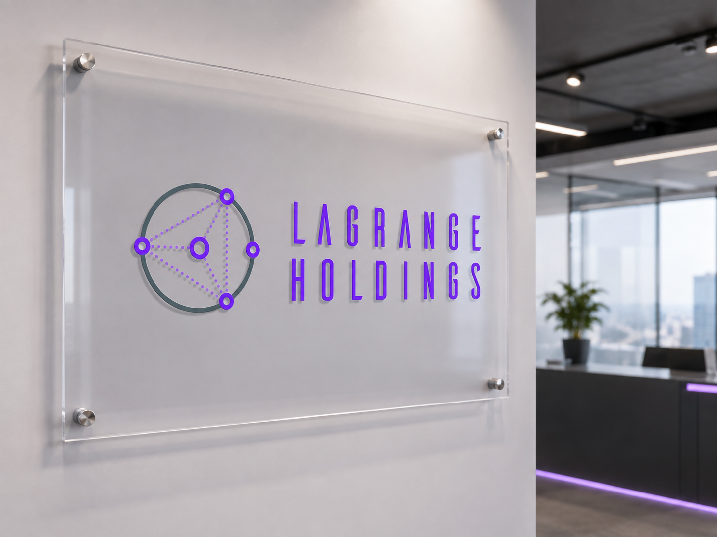
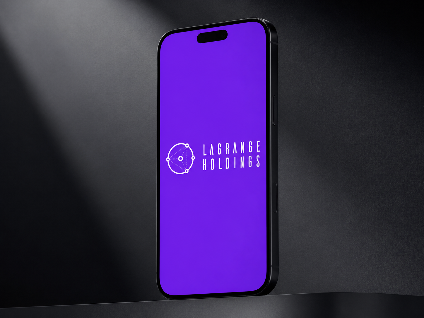
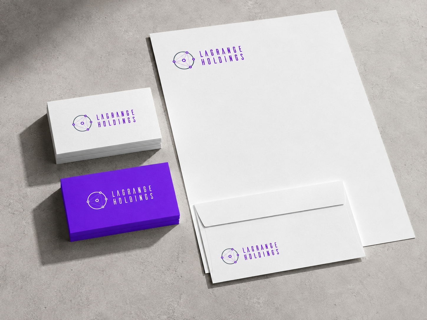
The outcome
The finished concept gives LaGrange Holdings a clear and distinctive visual identity that avoids the more predictable visual language often used within cryptocurrency branding.
The combination of network geometry, condensed typography and a bold purple palette creates a mark that feels modern, technical and adaptable.
Project note: This identity was developed as part of an early-stage branding project. I was not involved in the final rollout, so the work shown focuses on the logo concept and visual direction.
Services
- Logo design
- Brand identity concept
- Custom symbol development
- Wordmark design
- Typography selection
- Colour palette development
- Logo lock-up variations
- Reversed logo design
Need a technology brand that feels distinctive without relying on predictable industry imagery?
I create clear, flexible identities that turn technical ideas into memorable visual systems.