Midas Masonry
The Project
Midas Masonry is a Devon-based brick, block and stone contractor founded by Adam and Steve.
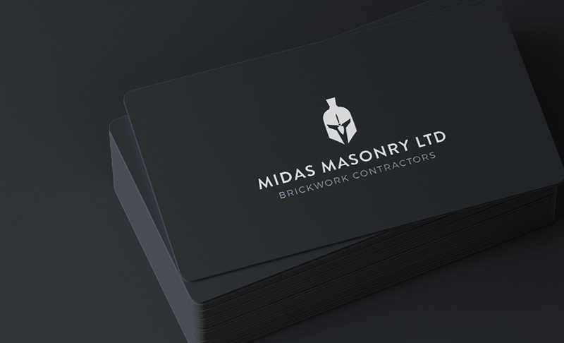
They wanted a professional identity for the new business that referenced the Greek heritage behind the Midas name without feeling overly decorative or traditional. I developed a clean, contemporary logo centred around a custom symbol that combines a Greek warrior helmet with a hidden bricklaying trowel.
Turning the name into a visual idea
The name Midas immediately offered a strong link to Greek history and mythology, but the challenge was to use that reference in a way that still felt relevant to a modern construction business.
Rather than relying on a literal or overly ornate interpretation, I focused on creating a simple mark that could communicate strength, precision and craftsmanship.
Developing the logo concept
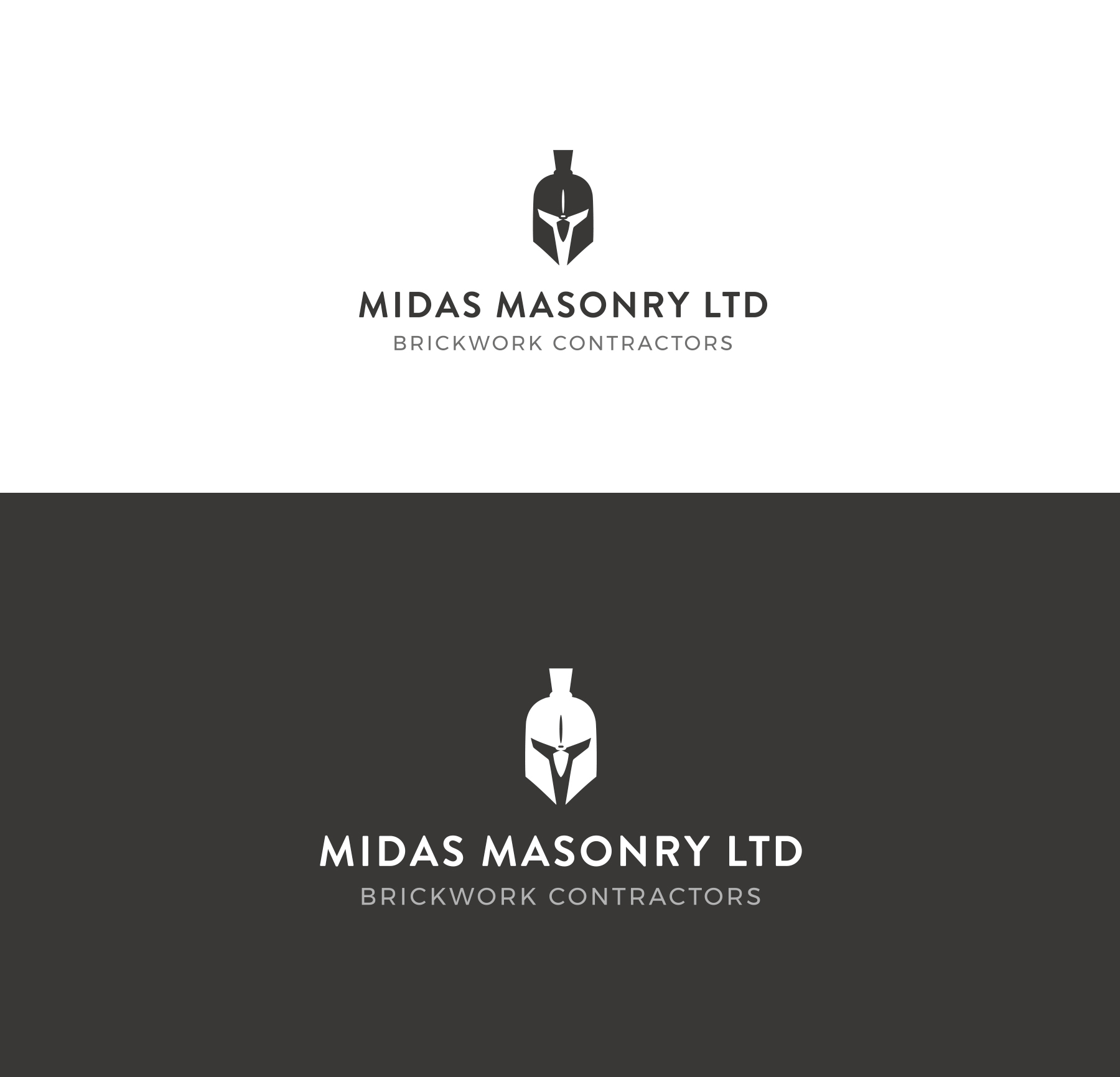
The final symbol combines the silhouette of a classical Greek helmet with the angular form of a bricklaying trowel.
The trowel is integrated into the negative space of the helmet, creating a hidden detail that rewards a closer look without compromising the clarity of the overall mark. This gave the logo a direct connection to the trade while keeping the Greek influence recognisable.
Creating a strong brand mark
The icon was designed as a compact, symmetrical brand mark that could work independently from the wordmark.
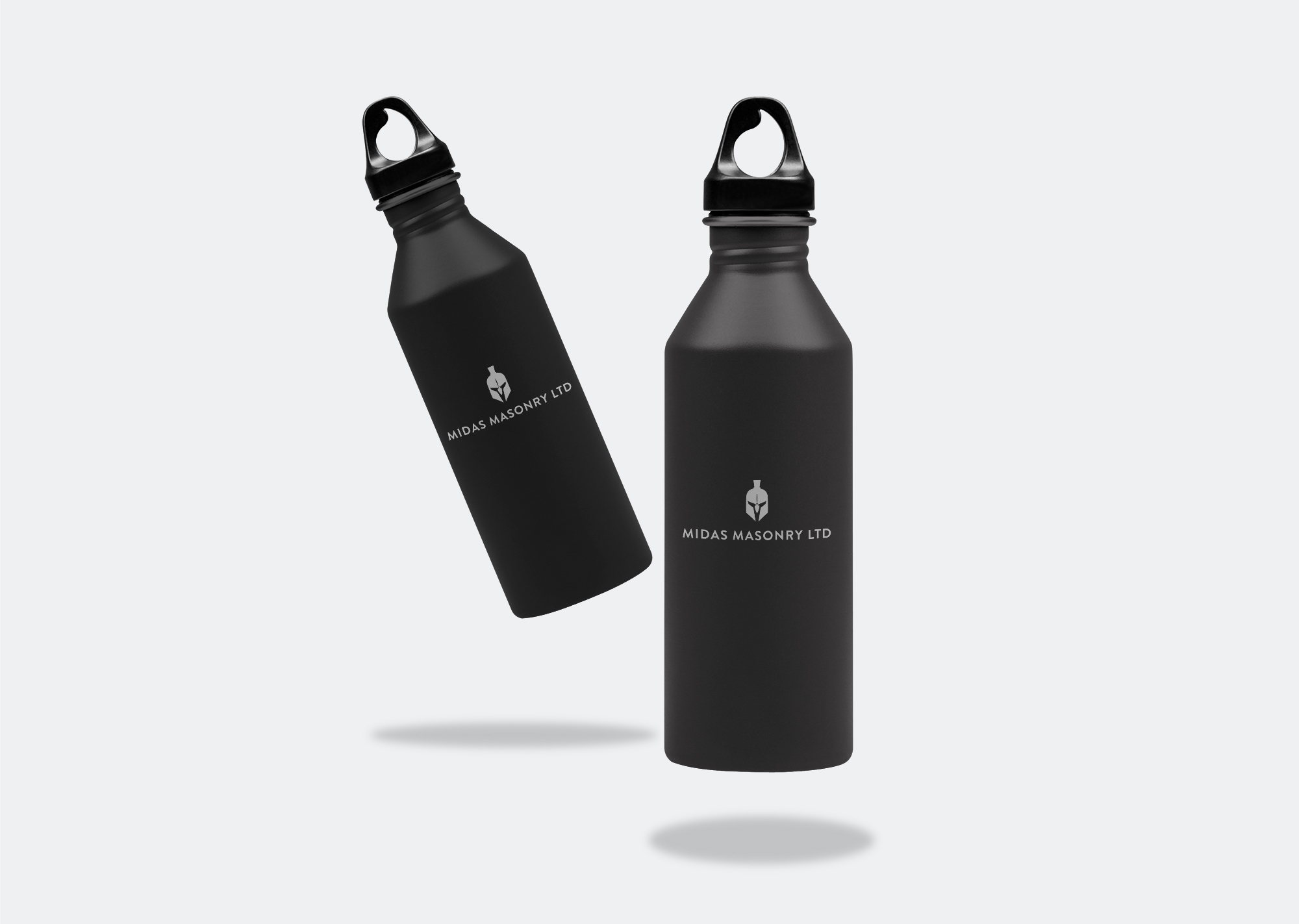
Its simplified geometric construction makes it suitable for a wide range of practical applications, including workwear, vehicle graphics, signage, social media and printed materials. The strong silhouette also allows it to remain recognisable at smaller sizes.
Typography and wordmark
The wordmark uses clean, widely spaced uppercase lettering to create a confident and established feel.
The main business name is given clear prominence, while the descriptor, “Brickwork Contractors”, sits beneath it in a smaller secondary line. This creates a clear typographic hierarchy and helps explain the company’s service immediately.
The restrained typography balances the more characterful symbol and gives the full logo a professional, contemporary finish.
A practical colour system
The identity was developed around a monochrome palette, allowing the logo to work in white, black and single-colour formats.
This was important for a construction business, where the logo may need to be reproduced across dark workwear, printed stationery, site boards, embroidery and vehicle livery. The high-contrast treatment also gives the brand a strong and premium appearance.
The result
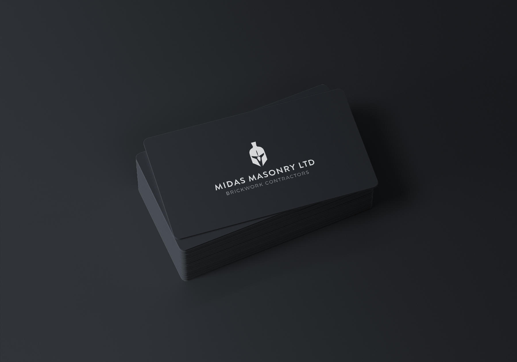
The finished identity gives Midas Masonry a distinctive and professional presence from launch.
The combination of the Greek helmet, concealed trowel and structured typography creates a logo that feels relevant to the company name, closely connected to its trade and flexible enough for everyday use across the business.
Services
- Logo design
- Brand identity development
- Custom symbol design
- Wordmark design
- Typography selection
- Logo lock-up development
- Monochrome logo system
- Business card design
Starting a new trade or construction business and need an identity that feels established from day one?
I create distinctive, practical logos that connect your name, services and story in a way that works across everything from business cards to workwear and vehicles.