Condeco
The Project
Condeco provided meeting room and desk booking software for businesses managing increasingly flexible workplaces.
I worked with its product, content and development teams to restructure the product area, improve the user experience and refresh the visual direction across the website.
Responding to a changing workplace
The shift towards flexible and hybrid working changed the way businesses used offices, meeting rooms and shared spaces.
Condeco needed to adapt how it presented its products and clearly explain its solutions for personal workspace booking and meeting space booking. The existing website contained a large amount of useful information, but the product hierarchy and terminology needed to be simplified.
Restructuring the product experience
The initial scope focused on reviewing the existing product content and reorganising it around Condeco’s updated terminology.
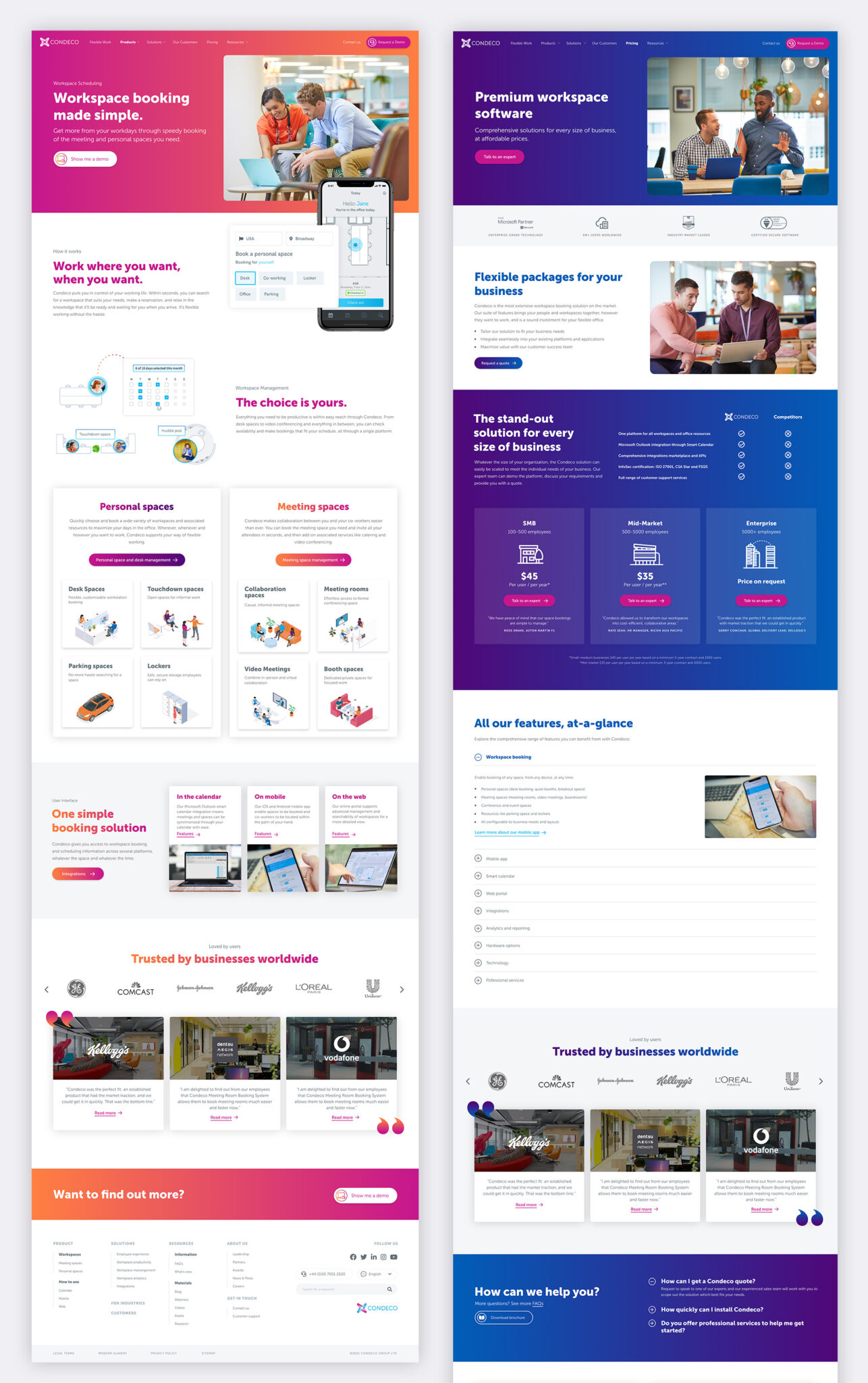
I worked with the product manager and copywriters to create a clearer sitemap and page hierarchy, separating the software products and interfaces from the wider corporate content. This gave users more direct routes into the information most relevant to their needs.
Refreshing the visual direction
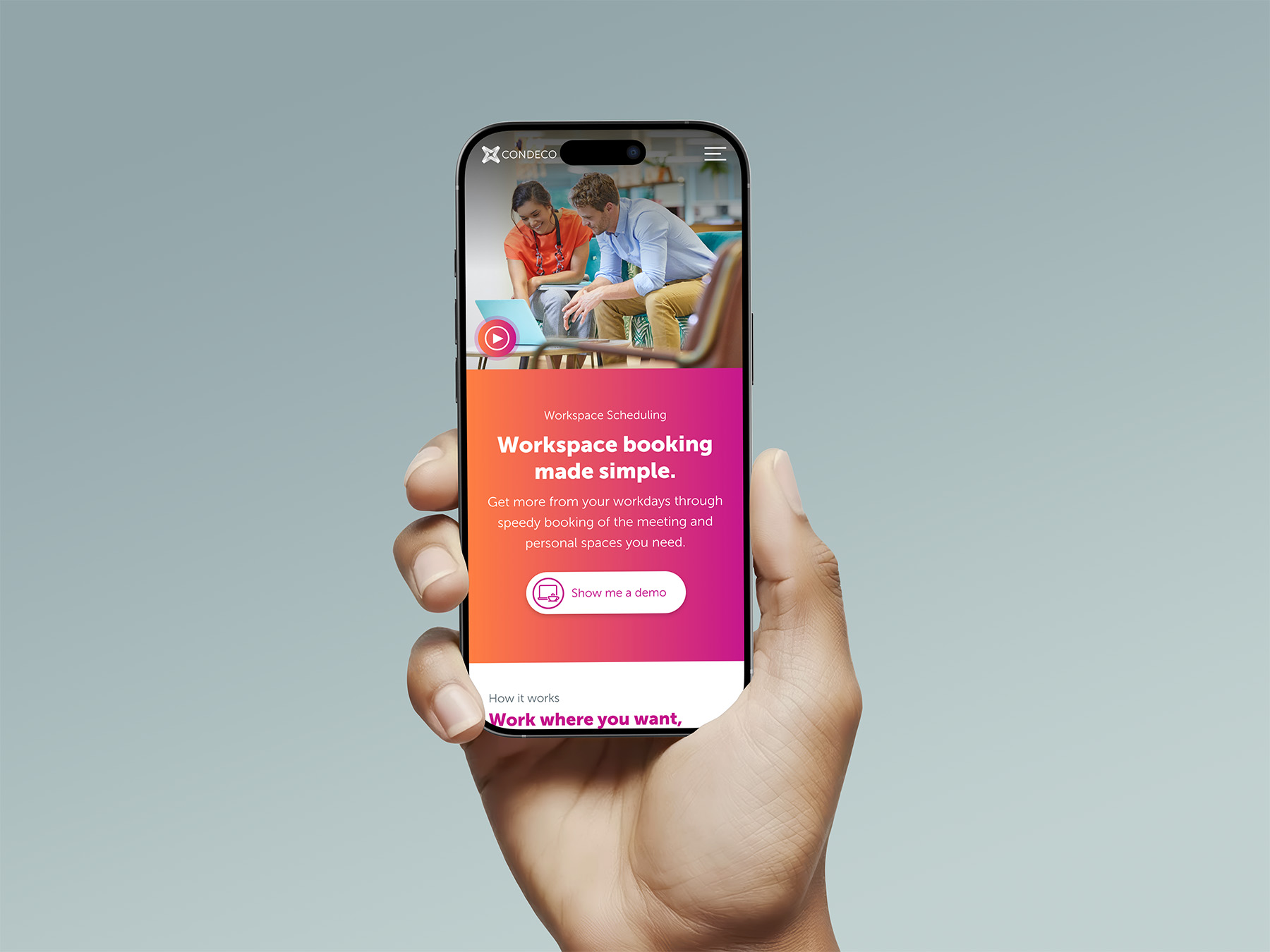
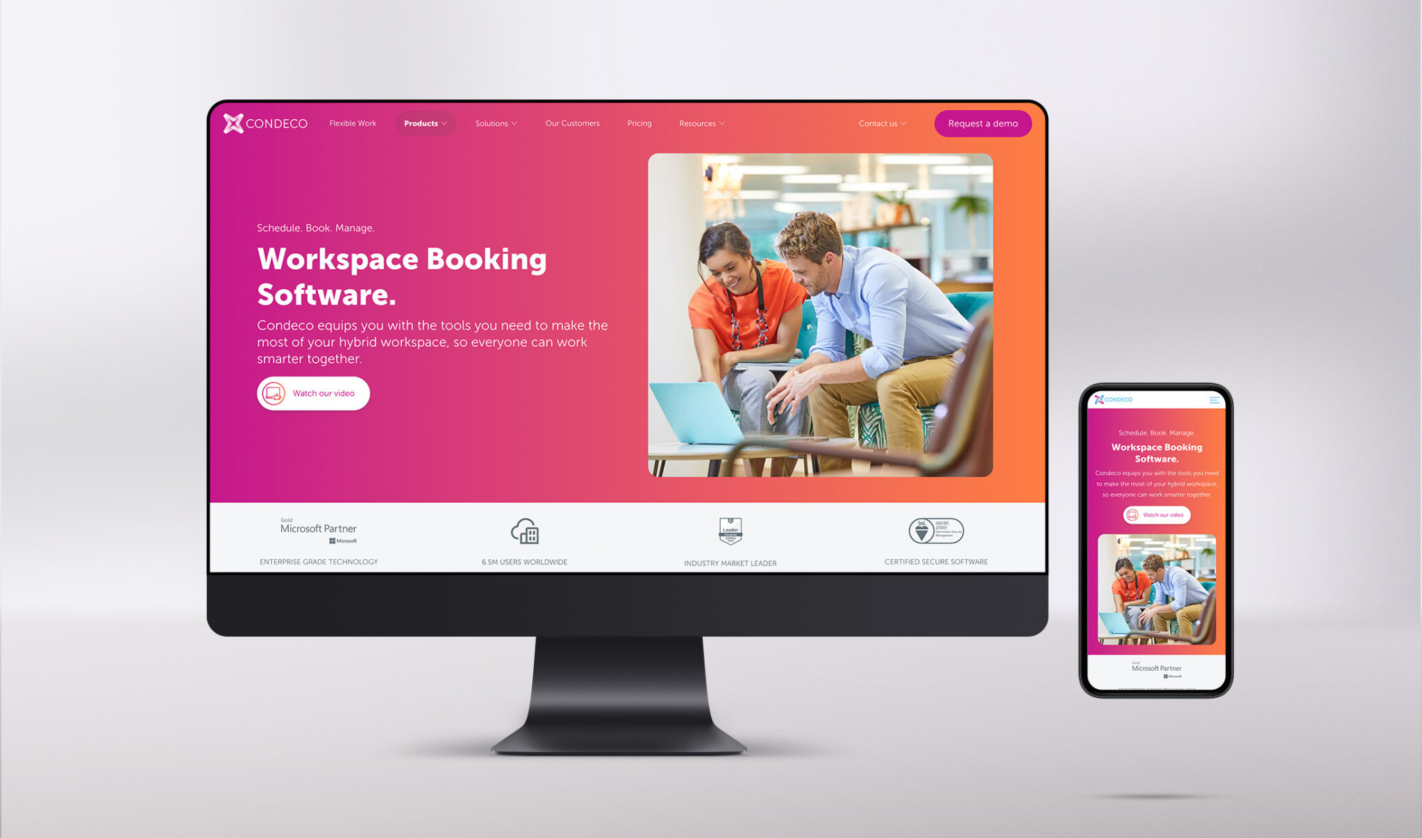
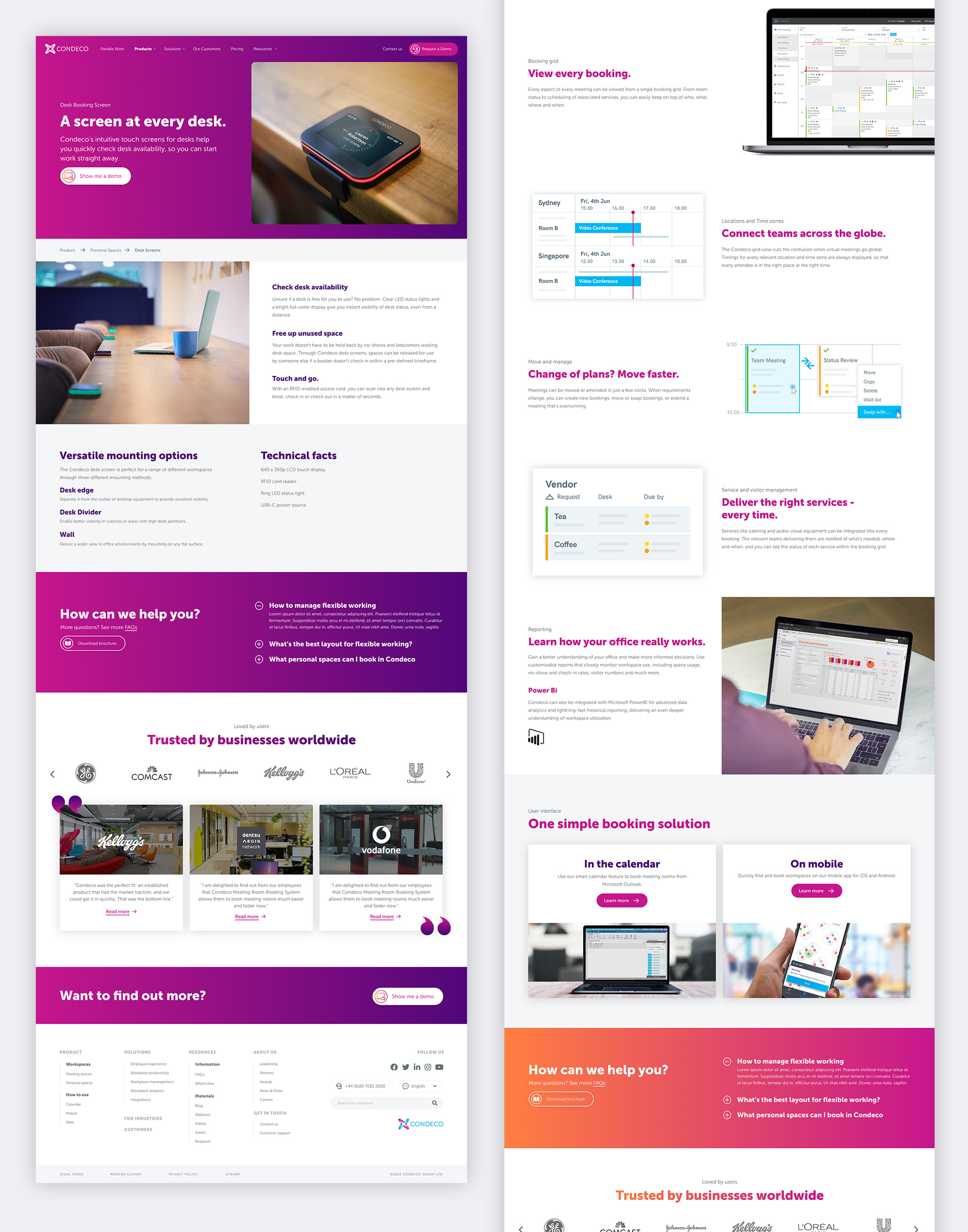
Alongside the UX review, I redesigned the look and feel of the product pages to create a brighter, more focused and consistent experience.
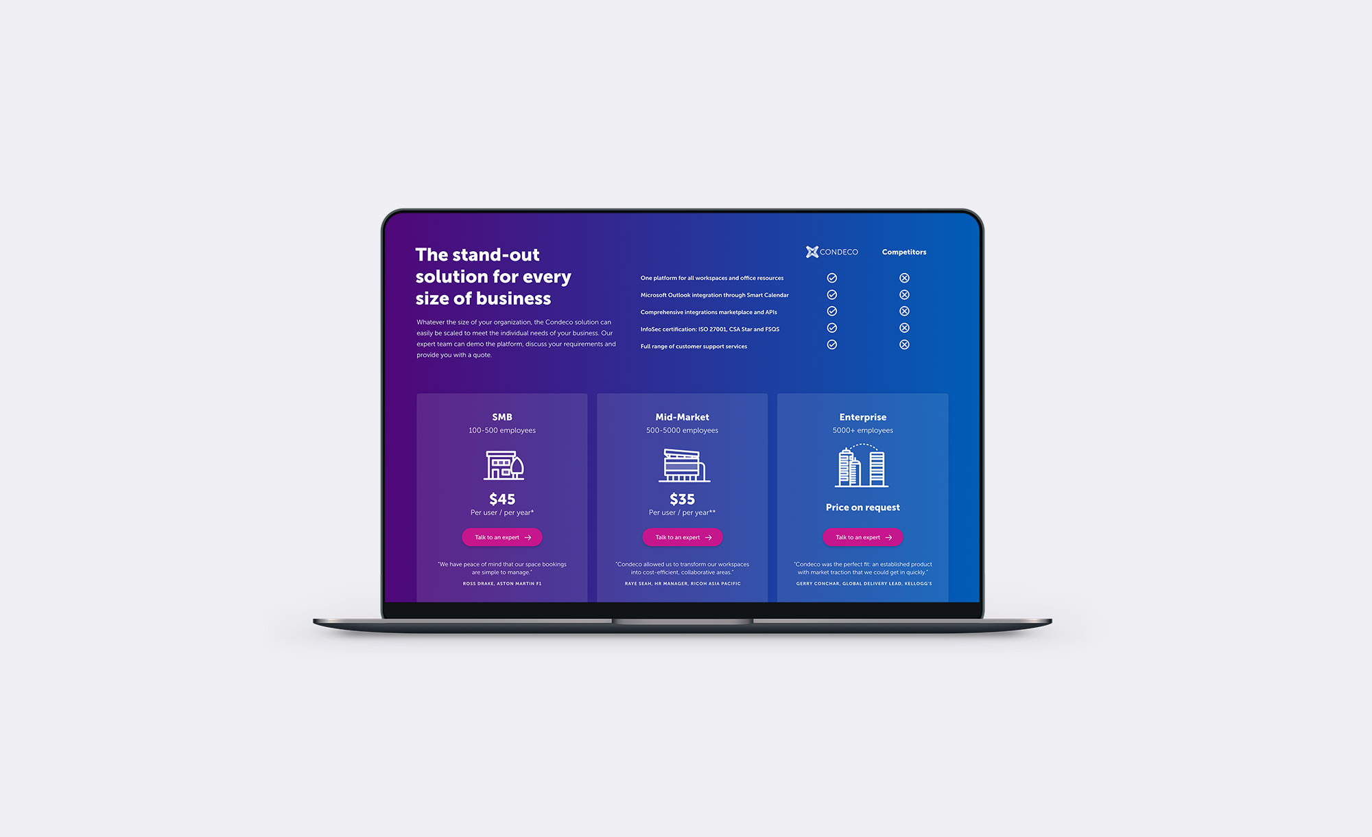
The new layouts used stronger typography, clearer calls to action and flexible content sections to explain the software without overwhelming users. The bold gradient and supporting imagery helped give the product area a more distinctive and contemporary feel.
Expanding the scope
The success of the initial product redesign led to the project expanding into other areas of the website.
I designed new experiences for an integrations marketplace and support portal, as well as wider UX improvements including a reorganised navigation system and the introduction of breadcrumbs. These changes helped users move more easily between products, resources and support content.
Simplifying the software UI
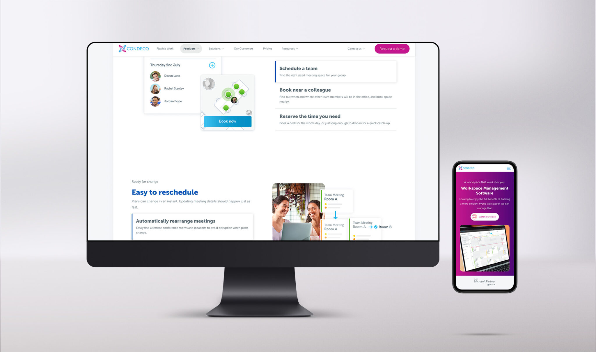
My role also included creating simplified interface illustrations to represent Condeco’s software features throughout the website.
Rather than relying on detailed product screenshots, I developed a cleaner visual style that highlighted the most important actions and information. I also created supporting diagrams, graphics and icons to make more technical features easier to understand.
Supporting animation and development
I worked closely with Condeco’s internal team, developers and animators to bring the interface graphics and website designs to life.
This involved explaining how the visuals should behave, reviewing implementation and ensuring the responsive experience remained consistent across desktop and mobile.
The result
The redesigned website gave Condeco a clearer product structure and a more modern way to communicate its workplace booking software.
What began as a focused redesign of the product area developed into a broader website improvement project, creating a more consistent visual system and a simpler experience across product, integrations and support content.
Project note: Condeco has since become part of the Eptura brand and the original website is no longer live. The designs shown here reflect the Condeco website and product experience I worked on before the transition.
Services
- Website design
- UX review
- Information architecture
- Sitemap development
- Responsive design
- Product UI illustration
- Icon and diagram design
- Navigation design
- Developer collaboration
- Animation direction
Does your software website make a complex product feel harder to understand?
I help technology businesses organise detailed product information into clear, engaging website experiences that are easier to navigate and easier to act on.