Margaret Pyke Trust
The project
The Margaret Pyke Trust supports healthcare professionals through contraception and sexual health training, while also developing conservation projects that address the relationship between family planning, communities and the environment.
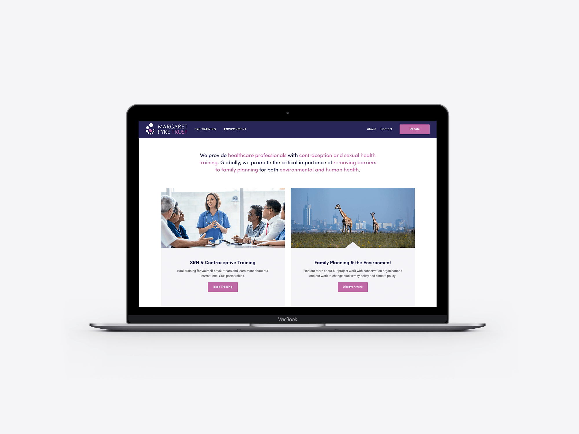
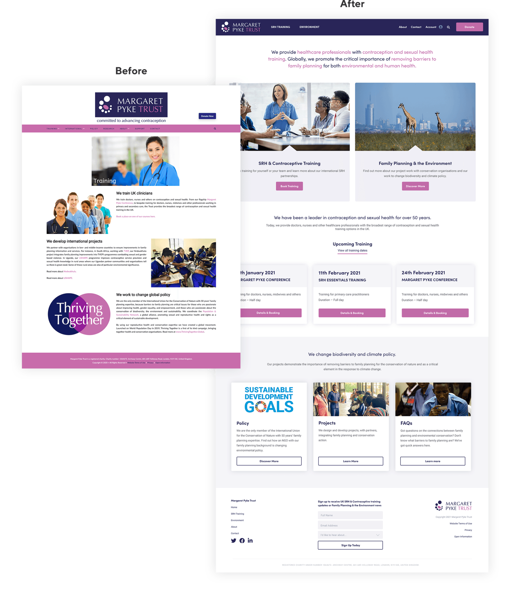
Working alongside Mutts and Misfits, I helped restructure and redesign the website around two clear areas: training and environment. The result was a more modern, intuitive experience with improved navigation, stronger content hierarchy and a clearer route through the training and booking process.
Bringing two areas of work together
The Margaret Pyke Trust has a distinctive remit, combining sexual and reproductive health training with international conservation and environmental projects.
The existing website contained a large amount of valuable information, but the structure made it difficult for users to understand the relationship between these areas or quickly find the content most relevant to them.
The project focused on creating a clearer digital experience without losing the breadth of the organisation’s work.
Restructuring the website
I worked with Mutts and Misfits to review the existing content, navigation and page hierarchy.
A key decision was to organise the site around two primary routes:
- sexual and reproductive health training
- family planning and the environment
This gave each audience a more direct path into the website while allowing the wider mission of the Trust to remain connected.
Improving navigation and content hierarchy
The previous site relied on a dense navigation system and long pages with limited visual distinction between different types of content.
The redesigned experience introduced a simpler menu structure, clearer headings and more obvious calls to action. Related information was grouped into reusable sections and cards, helping users scan pages more easily and move between training, policy, projects and supporting resources.
Redesigning the homepage
The homepage was reworked to provide a clearer introduction to the organisation and immediately communicate its two core areas of activity.
Large image-led panels direct visitors towards training or environmental content, while supporting sections introduce the Trust’s history, upcoming courses and current projects.
This created a more balanced page that could serve healthcare professionals, partners, supporters and wider audiences without overwhelming them.
Improving the training journey
Training was one of the most important functional areas of the website.
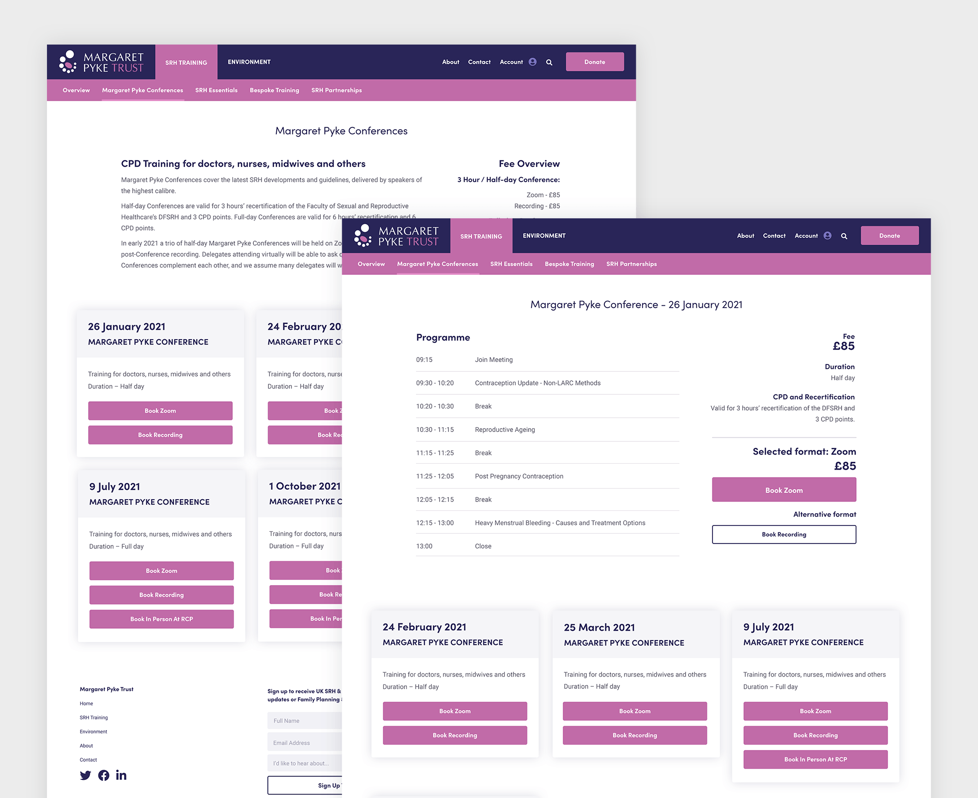
The existing process needed a clearer route from discovering a course through to viewing details and making a booking. I redesigned the course presentation using structured cards, stronger date and event information and clearer booking actions.
This made upcoming training easier to compare and reduced the amount of effort required to find the right course.
Creating a more modern visual system
The Trust already had an established identity, so the design work focused on modernising and extending it rather than replacing it.
I used the existing purple and pink palette in a more controlled way, supported by generous white space, stronger typography and a clearer grid. This helped the site feel more professional and contemporary while retaining recognition.
The revised layouts also made better use of photography, giving the organisation’s healthcare and conservation work a more human and engaging presence.
Designing reusable content blocks
The website needed to support a wide range of content, including training dates, projects, policy information, research and frequently asked questions.
I developed a flexible visual system using repeatable cards, content panels and call-to-action sections. This created consistency across the site while allowing different departments and subjects to be presented appropriately.
Working collaboratively
The project was delivered in collaboration with Mutts and Misfits, who supported the wider strategy and content direction.
My role focused on UX, information architecture and visual website design, translating the new structure into a cohesive set of responsive layouts for development.
The result
The redesigned website gave the Margaret Pyke Trust a clearer and more confident digital presence.
The split between training and environmental work made the organisation easier to understand, while improved navigation and course layouts created a more straightforward experience for healthcare professionals looking to book training.
The updated visual system also provided a more flexible foundation for communicating the Trust’s projects, policy work and international impact.
Agency collaboration
Agency partner: Mutts and Misfits
My role: UX design, information architecture and website design
Services
- Website design
- UX review
- Information architecture
- Sitemap and navigation design
- Content hierarchy
- Training and booking journey design
- Responsive design
- Reusable component design
- Agency collaboration
Does your organisation have valuable content that has become difficult to navigate?
I help charities and purpose-led organisations turn complex information into clearer, more accessible website experiences that support both users and internal teams.